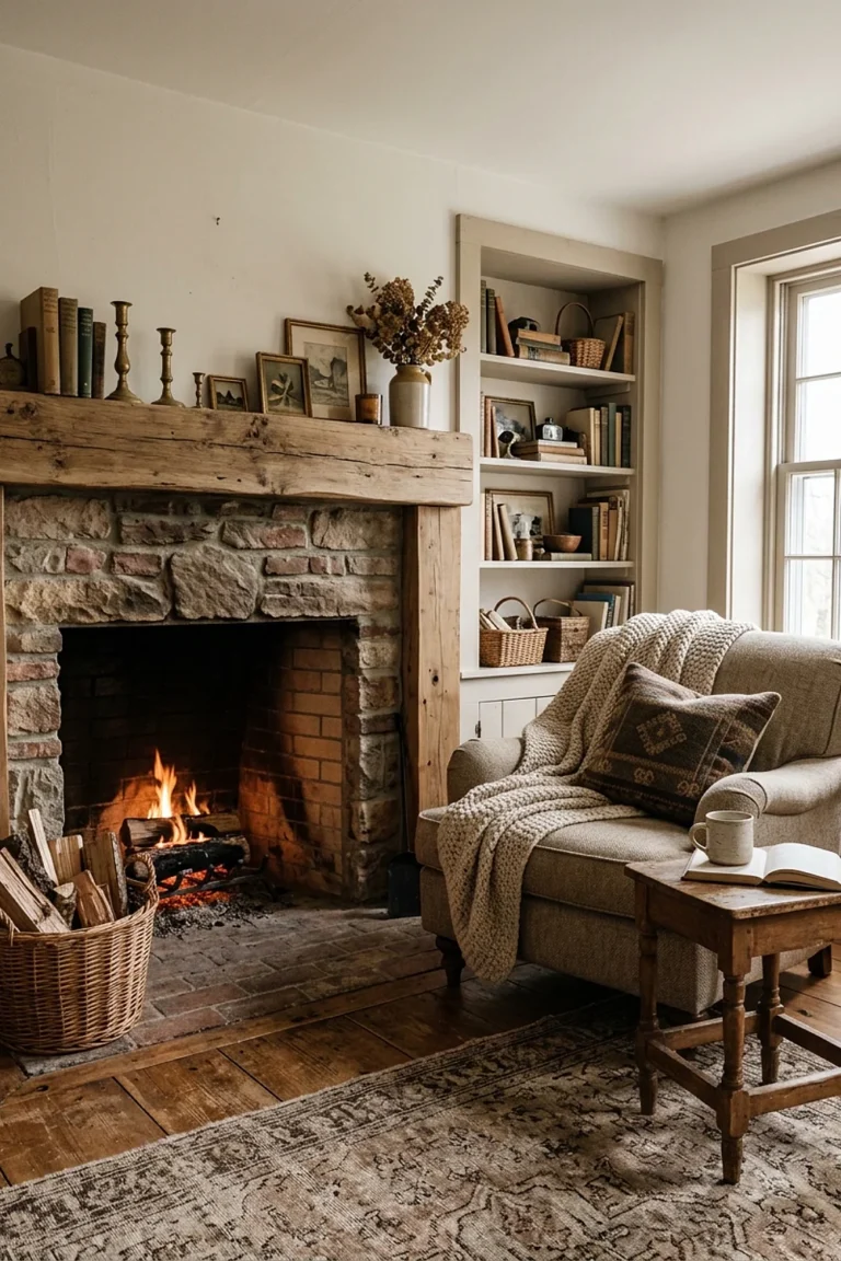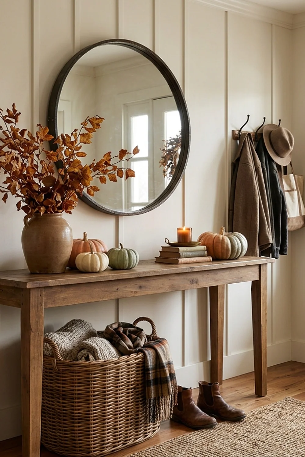
Pick one wall color, one door color, and three accents for your front hall by the end of this list, and the whole thing will hold together from the porch to the coat hooks. That’s the real job of fall entryway styling: a palette that still looks intentional at 4pm on a gray October Tuesday, when the light through the sidelights turns the color of weak tea.
Below are 28 palette pairings sorted by mood and undertone, with paint names to use as starting points. Test every one before buying a gallon, because entry light is rarely what it seems.
Fall entryway styling: Notes from real rooms
The best colors for a fall entry are yellow-leaning neutrals, deep greens, and spiced reds. Those undertones echo the leaves just outside the door, so the hall feels connected to the season instead of decorated against it. A cool blue-gray wall fights that scenery every time.
Here’s a rule of thumb worth memorizing: the smaller the room, the fewer the colors. Most entries run about 5 by 7 feet, and the eye takes in the whole room in one glance with nowhere to rest. Two main colors plus one accent is the ceiling.
And here’s the counterintuitive part. A deep color in a tiny, windowless foyer often reads larger than white, because the corners dissolve and the walls stop announcing where they end.
Before picking anything, answer three questions:
- Which direction does the front door face? North light is cool and flat, south light is golden.
- What color is the floor? Slate, oak, and black tile each pull a palette in a different direction.
- What can you see from the entry? The next room’s color should not argue with it.
1. Accessible Beige walls with oatmeal bouclé and wool
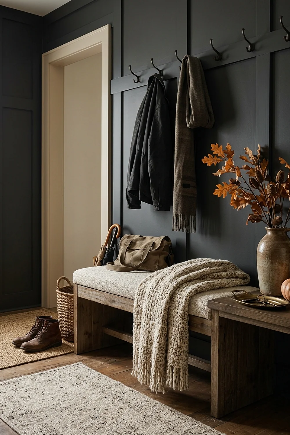
A greige like Sherwin-Williams Accessible Beige sits right between gray and tan. That’s why it welcomes a nubby oatmeal bouclé bench cushion without looking sleepy, and why it never flips pink next to rust-colored decor.
This is the palette for anyone who walks in tired and wants the hall to feel like a hand on the shoulder. A wool throw over the bench arm and a 20 by 30 inch bouclé cushion do the comfort work.
Skip a matte-on-matte scheme, though. One glazed ceramic piece breaks up the texture so the whole corner doesn’t go flat.
2. Chestertown Buff walls with crisp white trim
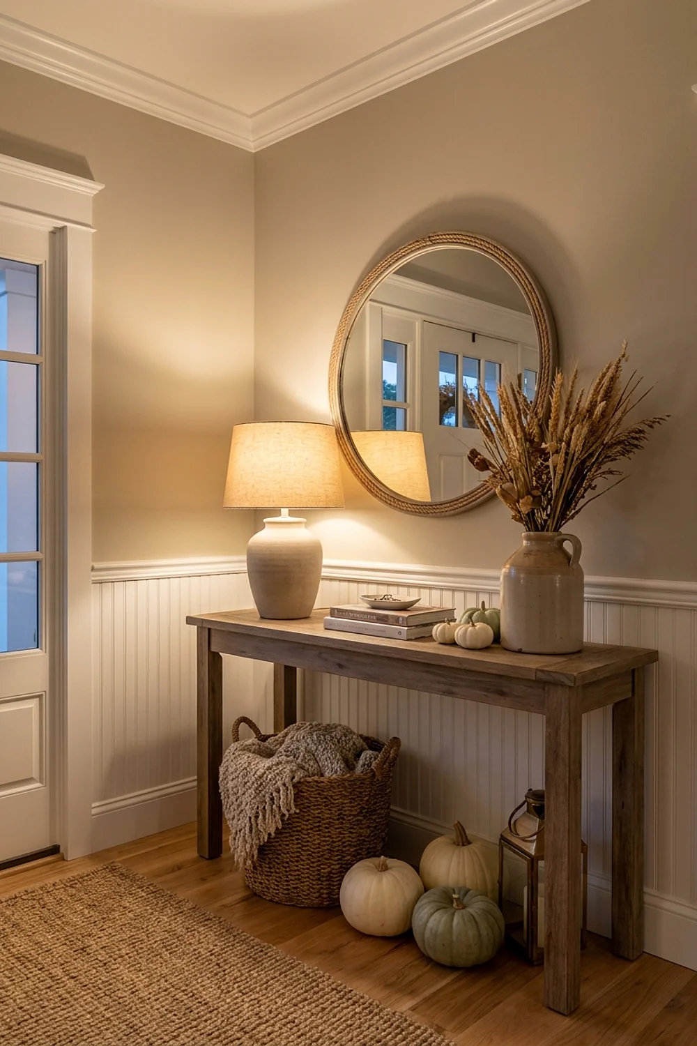
Benjamin Moore Chestertown Buff is a soft, yellow-leaning tan that looks like dried corn husk, and a clean white trim such as White Dove gives it a sharp edge. The contrast frames the door and baseboards the way a mat frames a print.
It suits older homes with 8-foot ceilings and lots of molding, where the trim deserves attention. Keep the trim in satin or semi-gloss so scuffs wipe off.
The common error is choosing a stark, blue-leaning white for trim. Against buff it looks like a cold refrigerator door.
3. Revere Pewter walls with matte black hooks
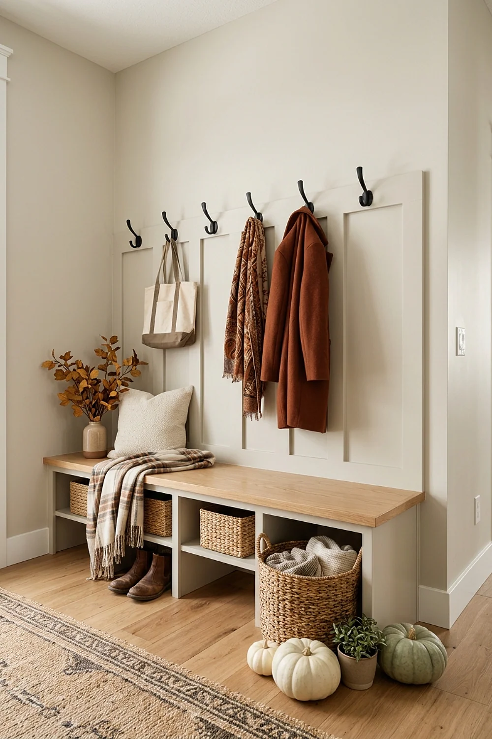
Against Benjamin Moore Revere Pewter, a mid-tone greige that holds up in weak light, matte black hooks or a black rail look drawn with a pencil. The pairing is crisp but not harsh, and it makes a plaid coat or a rust scarf stand out.
Watch the lighting, though. In a north-facing hall, Revere Pewter can drift toward cool gray, so bring in amber bulbs around 2700K to rescue it.
A solid black hook rail runs about $35 and is the cheapest way to make this palette look finished.
4. Cream walls with seagrass baskets and tobacco rattan
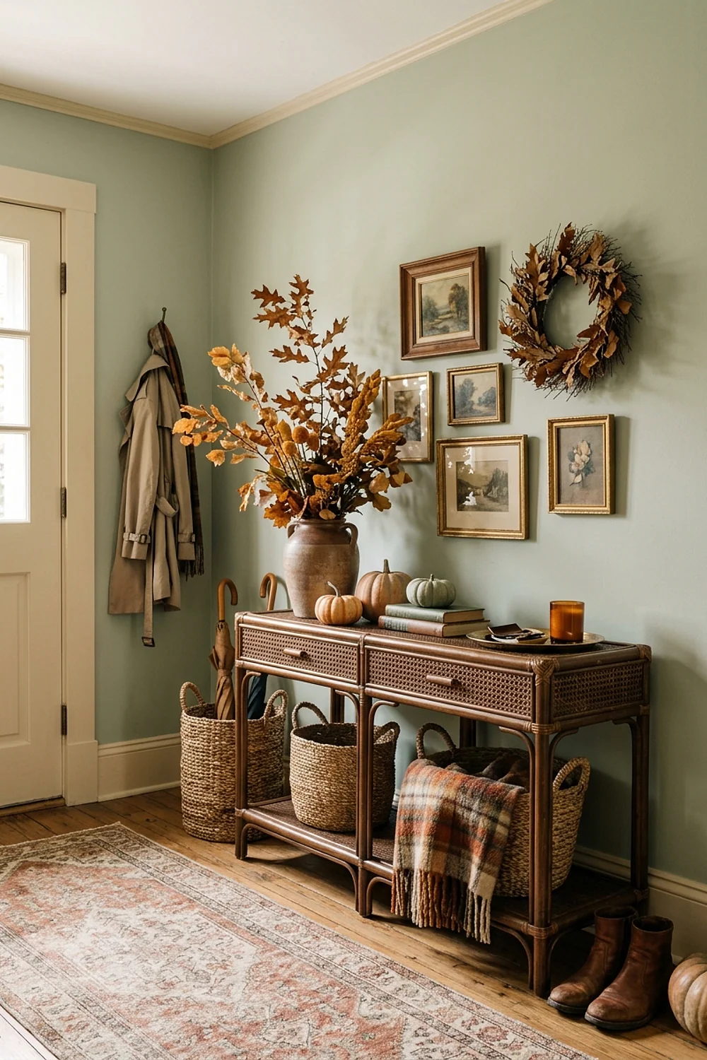
A cream wall with two lidded seagrass baskets under the bench gives shoes, gloves, and dog leashes a hidden home. The tobacco brown of the rattan and the pale cream wall stay within one color family, so the clutter never looks loud.
This is the right pick for families who drop everything at the door. Baskets 14 to 16 inches wide fit most benches, and lidded ones keep the palette calm.
Avoid open wire bins. They show every mismatched sneaker and break the quiet color story.
5. Mouse’s Back walls with a long wool runner
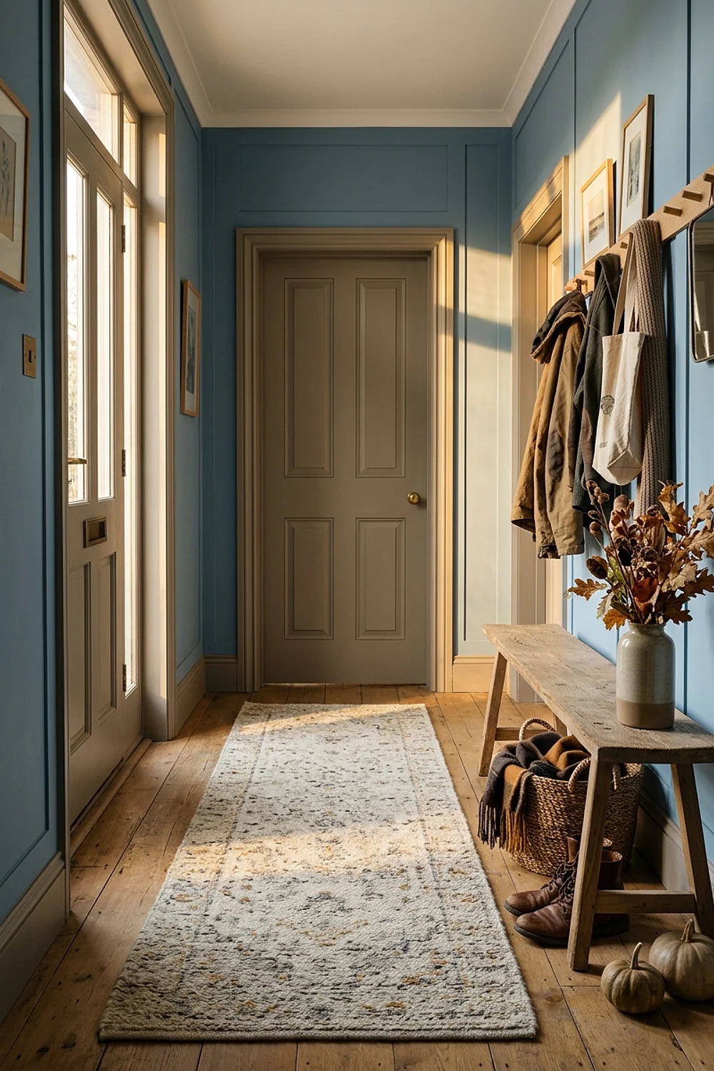
Farrow & Ball Mouse’s Back is a brown-gray with enough depth to make a narrow hallway feel deliberate. Lay a 2.5 by 8 foot runner in rust and cream stripes down the center, and the eye follows the line toward the back of the house.
This layout suits long, skinny entries, where the runner stretches the sightline. Leave 3 to 4 inches of bare floor on each side so the rug doesn’t look swallowed.
Add a rubber or felt pad. A loose runner at the front door is a slip hazard on wet October days.
6. Alabaster walls with white oak and honey tones
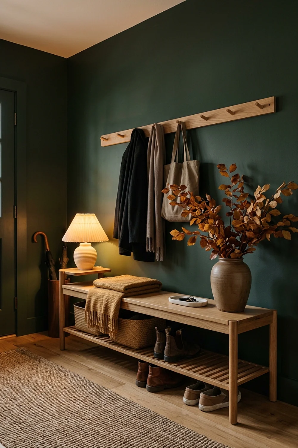
Sherwin-Williams Alabaster is a soft white with a hint of cream, and it makes honey-colored white oak look like it’s lit from within. A console in raw oak, 36 inches wide and 12 inches deep, is enough to hold keys and a bowl.
The wood does most of the talking here, so the palette suits minimalists who want fall without piles of gourds. One pitcher of dried stems is the whole seasonal story.
Choose a matte finish on the oak. A glossy varnish turns orange under bulbs.
The finishing touches
Fall entryway styling gets dramatic when the walls go dark. Deep shades turn a forgettable hall into a room with a mood, and they make brass, copper, and candlelight look like jewelry.
They work best in entries without much natural light, where white paint would only look gray anyway. Commit fully, though. Paint the trim and ceiling in a matching color or one step lighter.
7. Hale Navy walls with a copper mirror
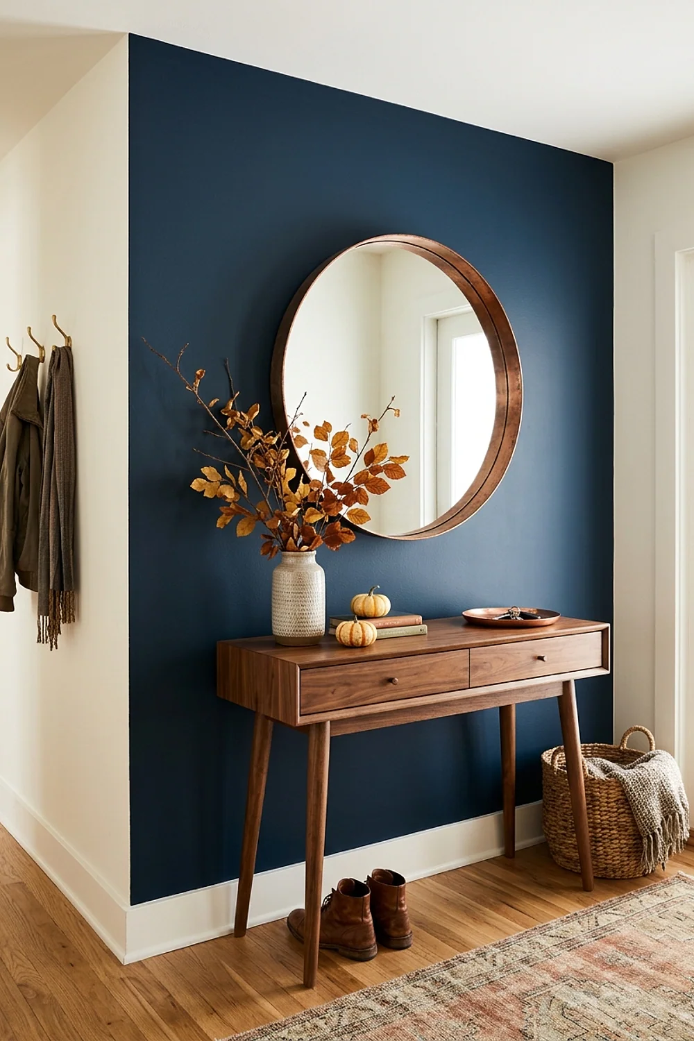
For a navy that behaves like a neutral instead of a sailor suit, Benjamin Moore Hale Navy leans gray. A 30-inch round copper-framed mirror against it throws amber light back across the room and doubles the glow of a single lamp.
It fits a tiny 5 by 6 foot foyer well, because the dark walls erase the edges. That’s the scale trick: the room stops reading as a box.
Use matte or eggshell finish. Glossy navy in a small space shows every roller mark.
8. Urbane Bronze walls with a brass lantern
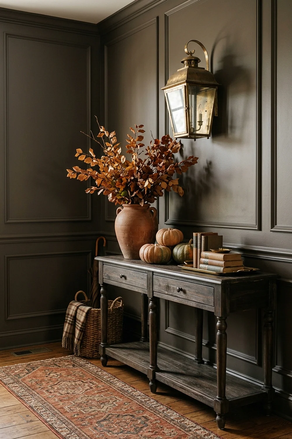
Sherwin-Williams Urbane Bronze is a smoky brown-gray that looks like wet bark. Hang one oversized brass lantern, about 14 inches across, and the dark wall suddenly looks like an old inn on a rainy evening.
This styling suits traditional and farmhouse entries with wood doors. A good lantern runs $90 to $150, and it carries the whole room, so spend there instead of on extra accessories.
Skip chrome. Its cold shine makes the bronze look dull instead of deep.
9. Studio Green walls with a rust runner
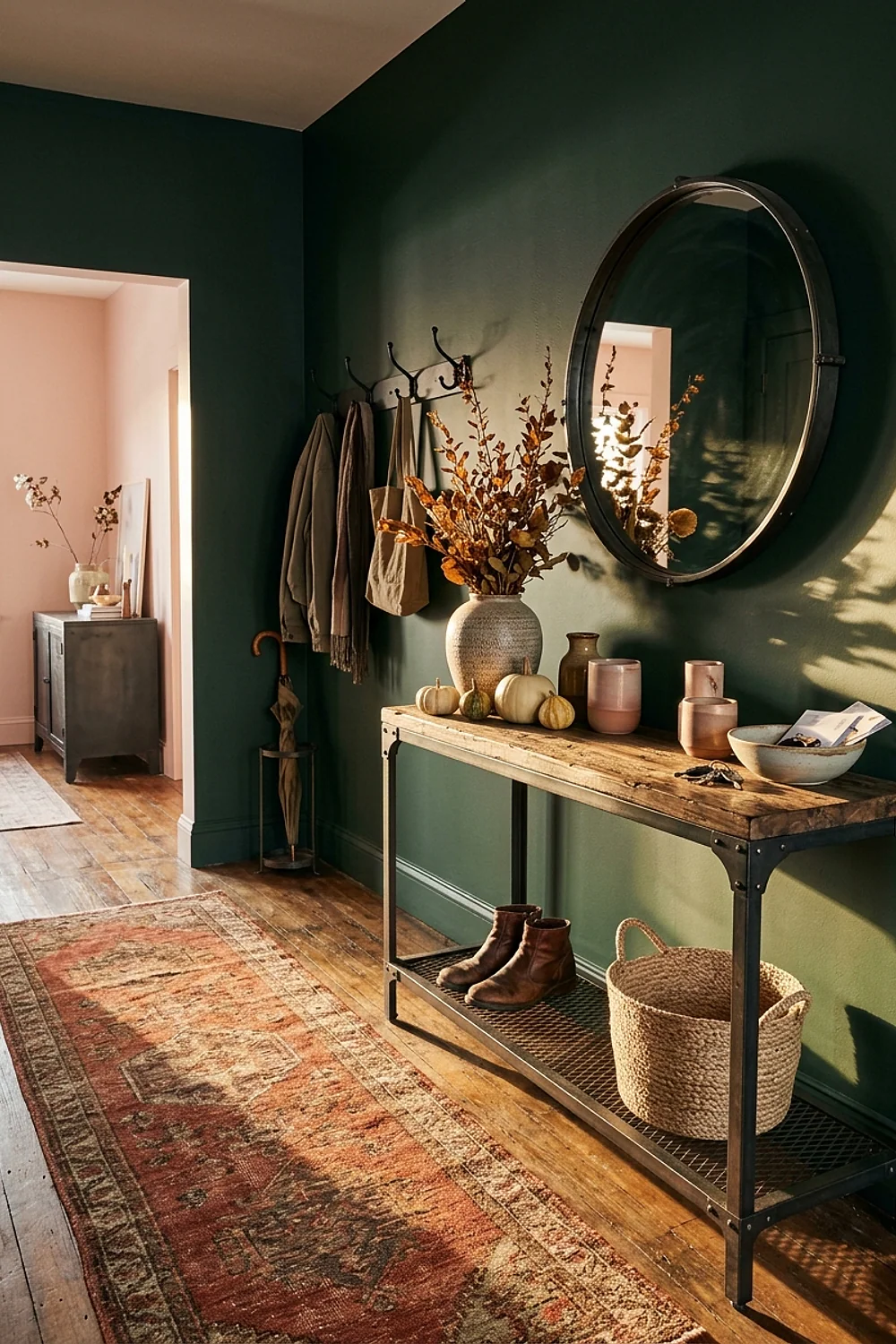
Almost black, with just enough forest in it to stay green under daylight, Farrow & Ball Studio Green is a very deep shade. A rust-colored runner on the floor makes a classic complementary pair that hides mud and dried leaves well.
The combination is built for homes with kids and dogs, since a patterned, dark rug forgives dirt that a light one shows by Wednesday. Choose a low-pile wool or polypropylene weave that survives boot traffic.
One thing to avoid: a shiny floor finish. Dark green walls over glossy tile can feel like standing inside a pond.
10. Kendall Charcoal walls with mustard lamplight
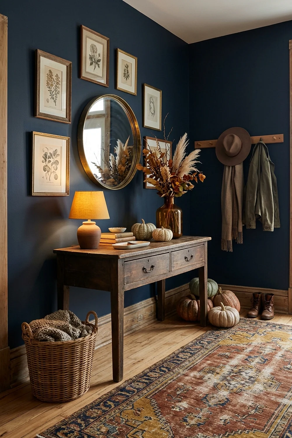
Lit by a table lamp with a mustard or saffron shade, Benjamin Moore Kendall Charcoal, a deep, slightly warm gray, glows like the last minutes before sunset. The yellow bounces off the charcoal and gives the entry its own afternoon.
Charcoal can swallow light fast, so plan for two sources: a ceiling fixture and a lamp at 2700K. A single bare overhead bulb will make this palette look like a parking garage.
Dimmable switches cost about $20 and let the mood change from morning rush to evening return.
11. Eating Room Red walls with creamy linen
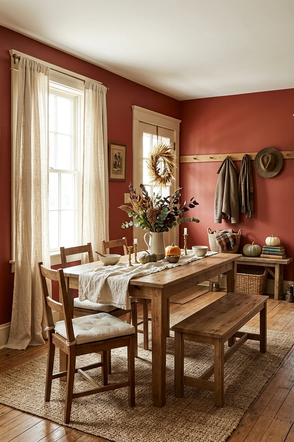
Like wine and old leather more than a stop sign, Farrow & Ball Eating Room Red is a brick-leaning red. A cream linen cushion and a pale jute rug keep the red from pressing in on you.
The color comforts in a way few others do, and it suits a small entry that you pass through quickly. Think of it as a hug, not a sitting room.
Avoid using it on all four walls if the foyer has no windows. Paint three walls and let the door side stay in a soft cream.
12. Brinjal walls with antique gold frames
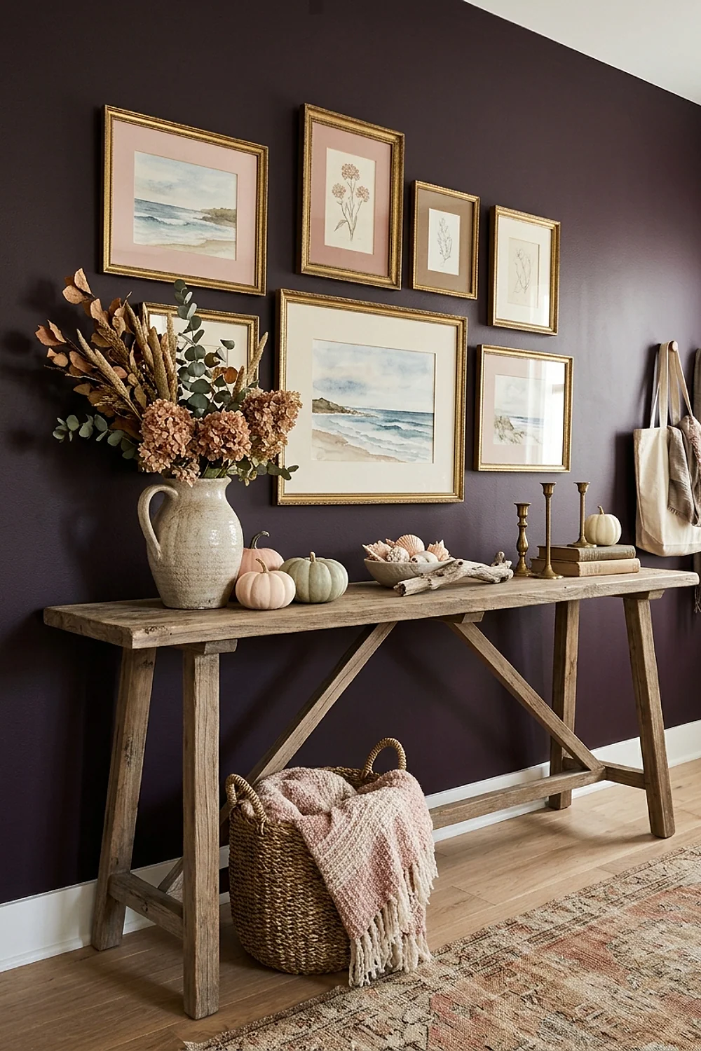
Gold-leaf frames look like they belong in an old library when they hang against Farrow & Ball Brinjal, a deep aubergine. A gallery wall of 6 to 8 thrifted frames in mixed golds costs about $60 at a flea market, and the purple tone hides the mismatch.
This one suits people who love secondhand finds and want the hall to feel collected. Hang frames 2 to 3 inches apart for a tight cluster.
Skip bright white mats. They glare against aubergine, and warm ivory looks far better.
Things that elevate the room
Fall entryway styling doesn’t need dark walls to feel seasonal. Soft greens, blushes, and buttery yellows bring in the mood of autumn through undertone and let the decor do the rest.
These palettes are best for entries with a window or glass door, where daylight keeps pale colors from going muddy. They are also kinder to people who repaint often.
13. Sea Salt walls with walnut furniture
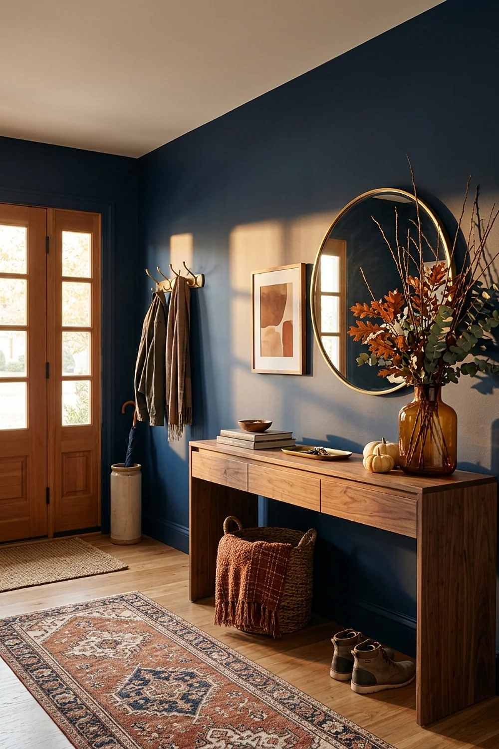
A dark walnut console keeps Sherwin-Williams Sea Salt, a gray-green that looks different every hour, grounded. The wood supplies the weight so the pale wall doesn’t float away.
The common mistake is picking Sea Salt in a north-facing hall, where it can read as a cold hospital color. Choose it for entries facing east or south, or add rust and amber accents to fix the chill.
One small hint: a walnut tray in the shade of the console ties the pieces together.
14. Sulking Room Pink with oak pegs and olive branches
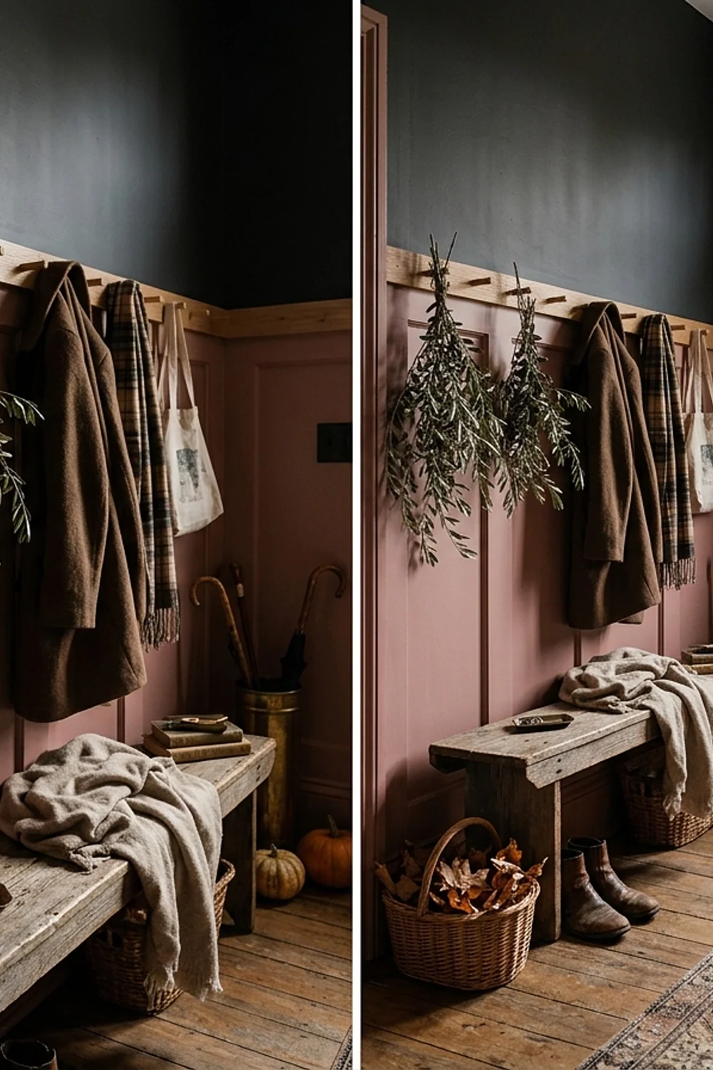
Closer to clay than to nursery, Farrow & Ball Sulking Room Pink is a dusty, earthy rose. A 36-inch oak peg rail with four pegs holds bags and hats, and a few dried olive branches in a jug keep the pink grown-up.
The peg rail makes this a good choice for small entries with no closet, since the storage lives on the wall at 60 inches off the floor. The color suits people who want softness without sweetness.
Avoid bright pink pillows. Stick with terracotta or deep olive so the blush stays muted.
15. Palladian Blue walls with pumpkins arranged in a diagonal
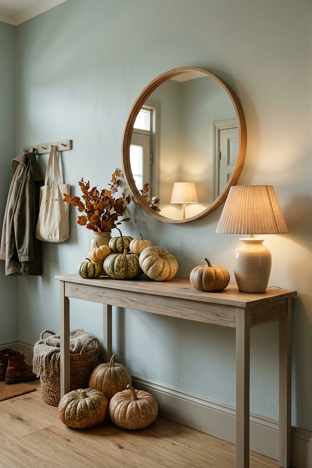
Turning almost silver at midday, Benjamin Moore Palladian Blue is a pale blue-green. Set three pumpkins in rust, cream, and sage along a bench in a loose diagonal and the cool wall makes the orange look sharper.
The diagonal matters. A straight row looks like a display shelf, while a staggered group, tallest at the back corner, looks like it landed there naturally.
This fits porches and glassed-in entries with plenty of light. Keep the pumpkin count at three, with … actually, no, scratch that. Make it five if the bench is over 48 inches, and vary the sizes.
16. Hawthorne Yellow walls with linen and wool
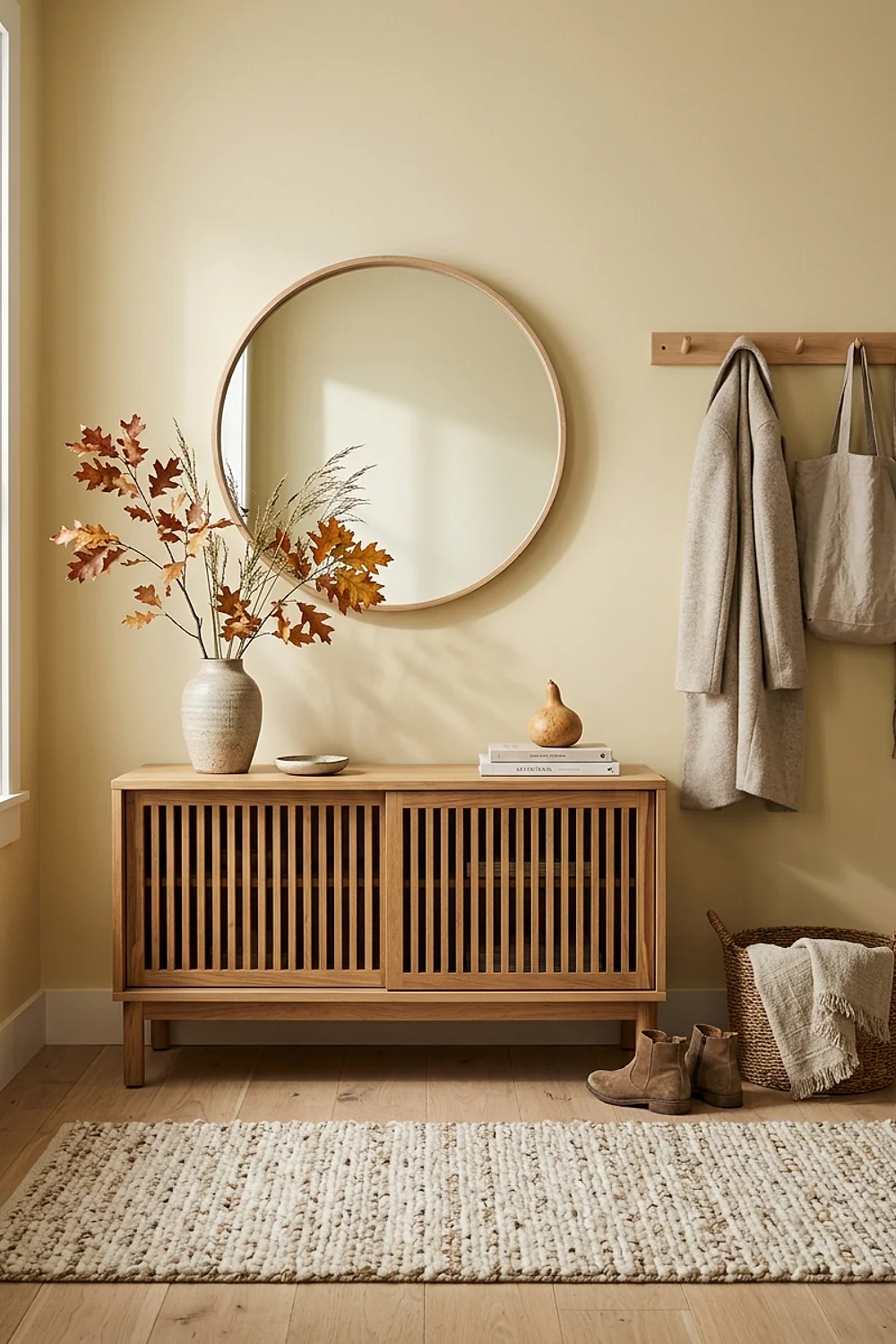
Nubby oatmeal linen and gray wool make Benjamin Moore Hawthorne Yellow, a soft, buttery color with no green in it, glow. The materials calm the yellow so it reads sunny, not loud.
It’s the right choice for a dim, interior hall that needs a lift on short November afternoons. A wool-blend cushion and a linen pillow in the same cream keep the layers soft.
Test it in daylight first. Yellow shifts more than any other color, and some versions go acid under LED bulbs.
17. Swiss Coffee walls with black and copper accents
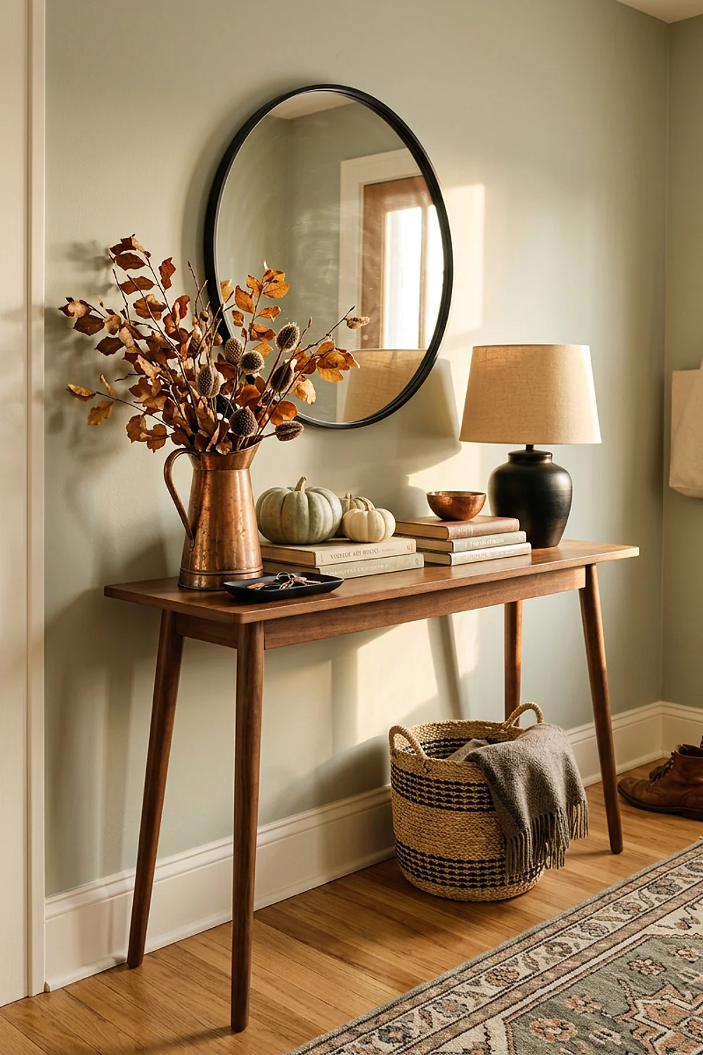
Black frames and a hammered copper bowl give Benjamin Moore Swiss Coffee, a creamy white that keeps its softness under bulbs, a clean, modern edge. The contrast is graphic but never cold.
This works in compact entries, about 4 by 6 feet, where a single large piece reads better than many small ones. A 24 by 36 inch black-framed print is plenty, and a copper bowl runs about $25.
Don’t mix more than two metals. Black and copper is enough, and brass will start a fight.
18. Greige walls with sage velvet and plaid wool
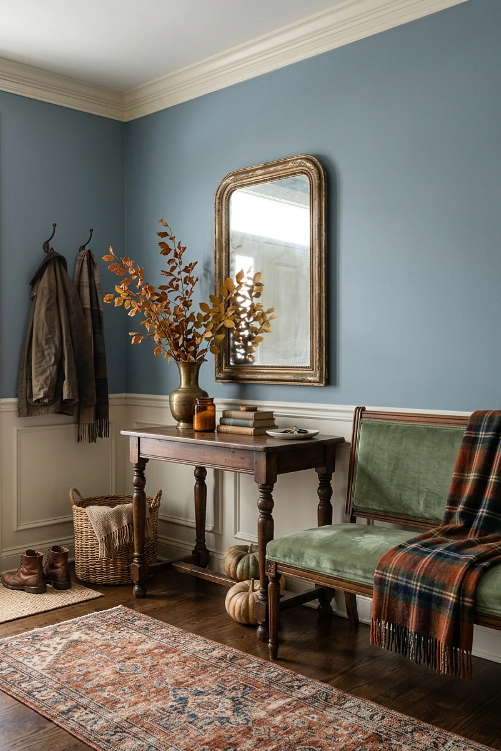
Together, a greige wall, a sage velvet cushion, and a plaid wool blanket in cream and olive make a calm triangle of color. Velvet catches light on its nap, which adds depth that flat paint can’t.
The trick is keeping the plaid muted, with thin lines and no bright red. A loud tartan will pull the eye away from the soft palette.
This styling suits renters, since all the color lives in textiles that move out with you.
Door colors and accent pairings that finish the hall
The front door is the first color anyone sees, and the inside decor should answer it. A door painted a bold fall shade sets the tone before the visitor steps inside.
Pick a door color that appears again indoors in at least one place, such as a pillow, a vase, or a frame.
19. A black door with rust mums

Potted rust mums look like they’re glowing against a front door painted Sherwin-Williams Tricorn Black. Black absorbs light, so every orange petal stands out against it with real intensity.
The setup works for brick and gray-sided houses with deep porches, where a black door anchors the facade. Use a semi-gloss or high-gloss finish so rain beads off.
Choose planters at least 12 inches wide. Small pots dry out in a day during dry fall weather and look sad against black.
20. A deep red door against sage interior walls
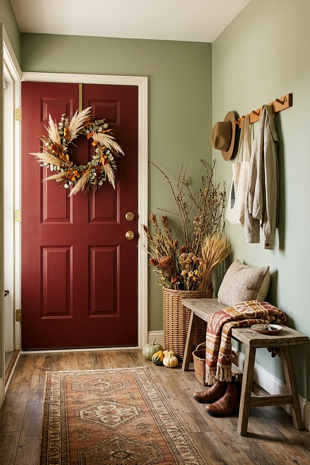
A red door seen from inside with the sun behind it lights the hall a faint pink-orange. Pair it with sage-green walls and the two colors balance each other, since red and green sit across the wheel.
Late afternoon is the best test. Around 4pm in October, low light through the red door tints the whole entry, so check that your wall color survives it.
A common mistake is choosing a bright cherry red. A brick or barn red keeps the effect soft.
21. A mustard door with navy surroundings
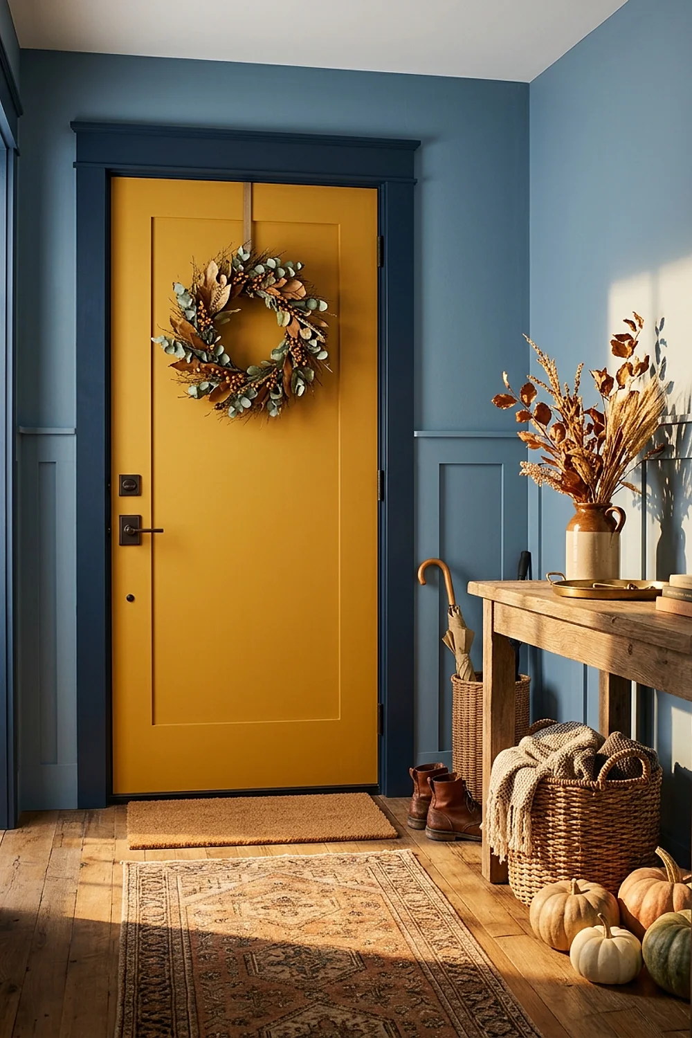
A mustard-yellow door set into navy siding looks like a lit window on a dark street. Inside, a navy runner and a mustard pillow carry the colors through, so the entry feels linked to the exterior.
The pairing is bold, so it suits people who want curb appeal and are not worried about neighbors. A quart of exterior paint is about $30 and covers a standard door.
Keep the mustard on the earthy side. A lemon tone fights the leaves.
22. Cavern Clay runner and burnt orange pillows against olive walls
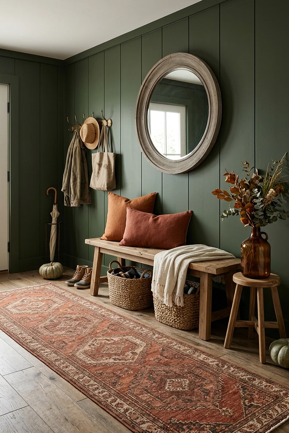
Olive walls look like an autumn field when a runner or cushion in dusty terracotta, such as Sherwin-Williams Cavern Clay, sits against them. The orange stays muted because the olive absorbs its brightness.
Use clay on the large, quiet items, like a rug, and burnt orange on small ones, like a single pillow. That keeps the saturation low and the palette easy to live with.
Avoid shiny orange plastics. They break the earthy mood in seconds.
23. Rust, plum, and gold in the same hall
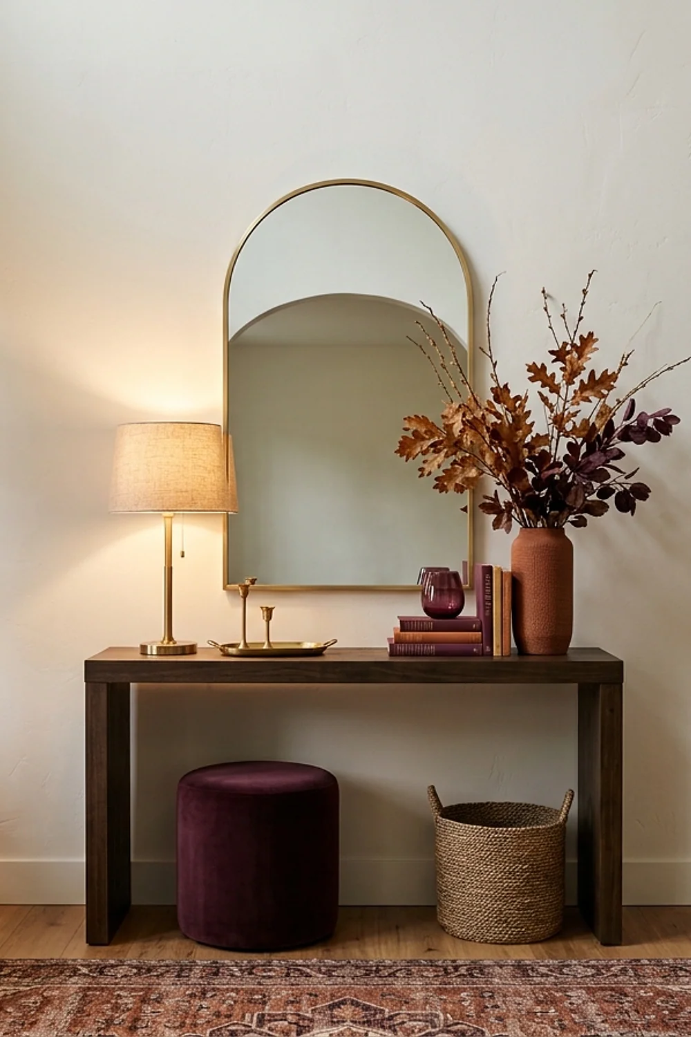
Rust, plum, and gold are all deep autumn jewel tones, and they work together when one leads. Let rust be the main accent, plum the supporting pillow, and gold a tiny frame or candle.
The mistake is giving every color the same volume. Three equal colors compete, while one lead with two supporting players reads as a plan.
This palette suits dark or mid-tone walls, where jewel shades look rich instead of muddy.
24. Cream and jute baskets that match the wall
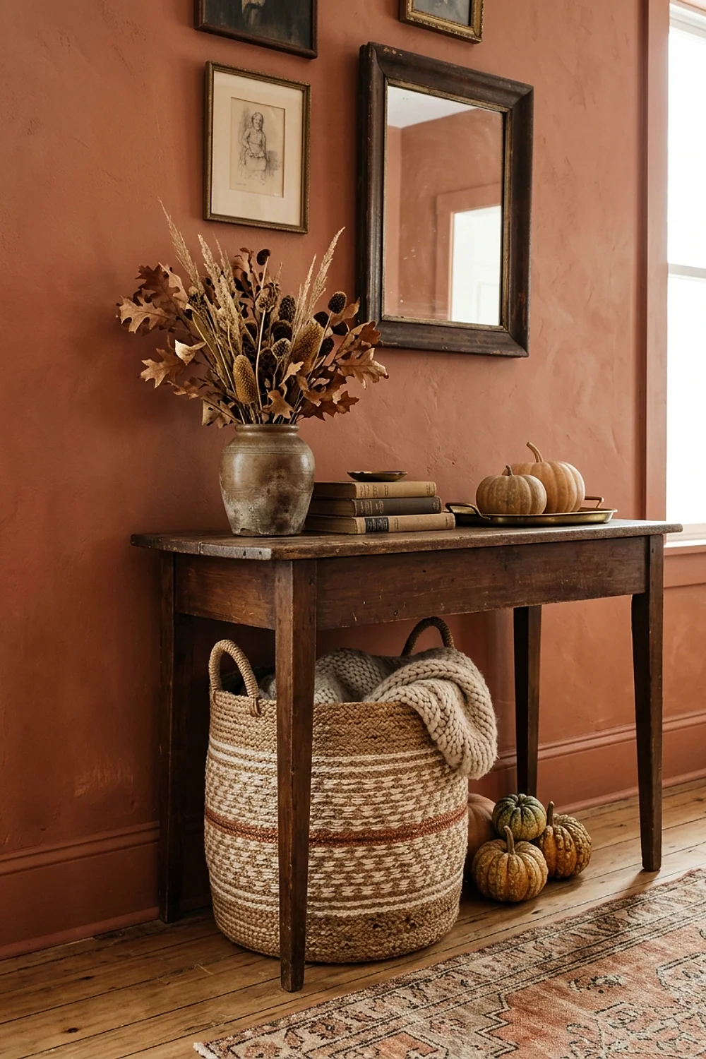
Baskets that match the wall color vanish from view, and that’s the point. A cream wall with cream-toned jute baskets under a 40-inch bench swallows shoes, umbrellas, and tote bags without adding visual noise.
This is the choice for small entries where every extra color feels crowded. Look for baskets about 12 inches deep so a pair of boots fits upright.
Skip dyed baskets in orange or red. They age badly and clash with real leaves.
Small details, big impact
The last layer of fall entryway styling is where the palette gets its personality. Metal, wool, and dried stems each bring a different texture, and the right ones tie a color plan together.
25. A brass mirror above a walnut console
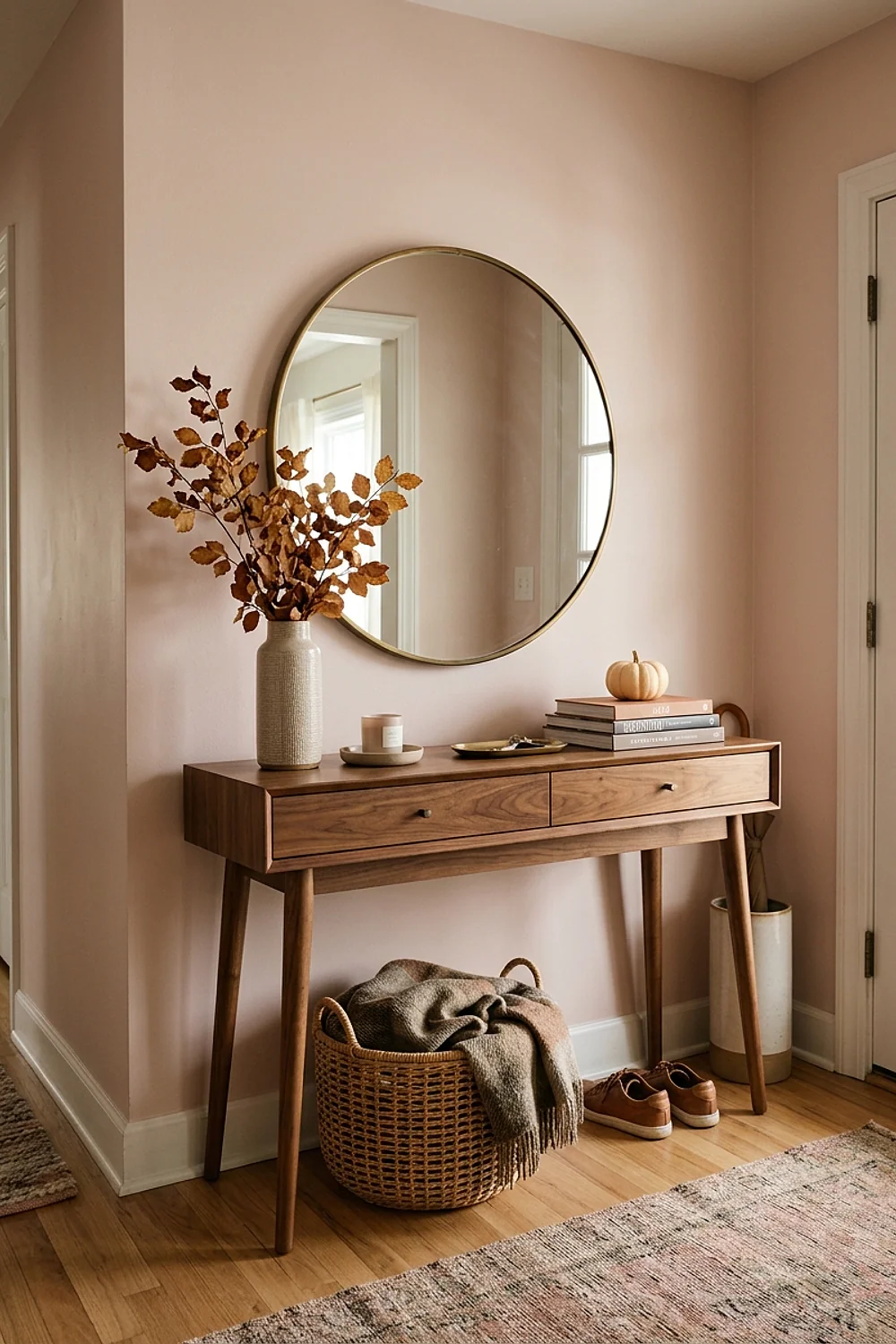
A round brass-framed mirror, 28 to 32 inches wide, hung 6 to 8 inches above a walnut console balances warm metal and dark wood. The two tones share a yellow-brown undertone, so they look like relatives.
Hang the mirror so its center sits around 60 inches off the floor, roughly eye level, and it also bounces daylight into the hall. A decent brass mirror costs about $80 to $120.
Avoid placing it directly opposite a cluttered closet. A mirror doubles whatever it faces.
26. Plaid wool and leather in a single brown family
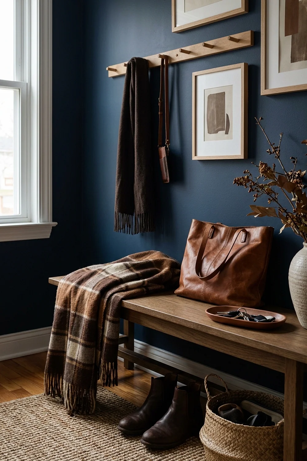
A plaid wool throw in cream, camel, and olive over a cognac leather bench is a palette you can touch. Leather ages into a deeper tone, while wool brings a soft, matte contrast.
Both materials handle wet coats and winter boots better than cotton. Keep the plaid scale small, with lines under an inch wide.
The usual blunder is pairing orange-leaning leather with a red-leaning plaid. Stay in the brown-camel range.
27. Dried wheat and eucalyptus in a tall ceramic jar
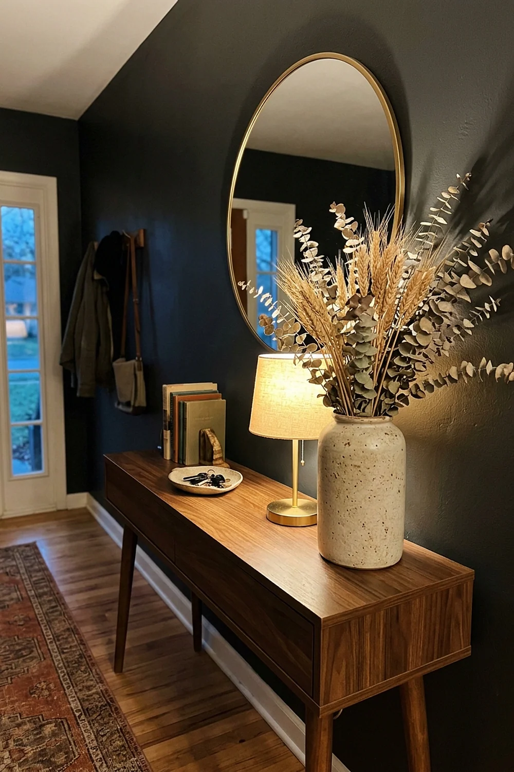
Dried wheat stems in a 16-inch ceramic jar bring a pale gold line into the hall, and a few eucalyptus stems add dusty gray-green. The two together look like a field at dusk and match nearly any wall color.
The jar should be about one-third the height of the whole arrangement, so a 16-inch vase suits 40-inch stems. A bunch of wheat runs about $12 and lasts all season.
Keep it away from the door. Drafts shed wheat everywhere.
28. A mixed gourd cluster in sage, cream, and rust
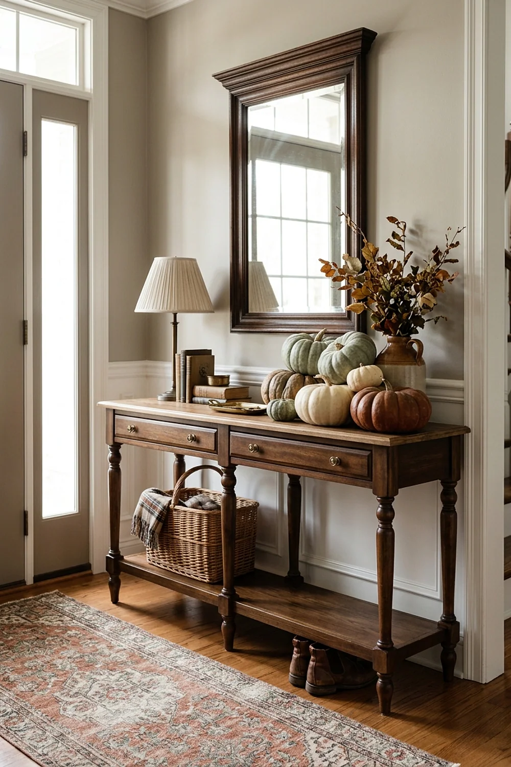
A cluster of gourds in muted sage, cream, and rust on a tray or wooden board reads like a still life, and it echoes the entire palette in one spot. Real or faux, the matte skin of the gourds drinks in light instead of reflecting it.
Group them in odd numbers, with the biggest to one side, so the grouping looks found instead of placed. A 14-inch tray keeps them from rolling.
Skip glittery or glossy finishes. Matte gourds age gracefully into November, and shiny ones look like party favors.
Testing colors before you commit
Testing colors is the cheapest insurance in decorating. A sample pot costs about $8, while a repaint of a foyer and door can take a whole weekend.
Fall entryway styling lives and dies on light, and entry light changes hourly. Follow this routine:
- Paint a 2 by 2 foot patch, or a large poster board, instead of a tiny swatch.
- Tape one board on the wall by the door and another on the wall facing it.
- Look at them at 8am, noon, and 4pm, and again with the lamps on at night.
- Lay the floor sample, the door color, and a pillow fabric beside the paint.
- Leave it up for 48 hours before deciding.
The color you dislike on day one is usually the one with the wrong undertone, not the wrong depth. Trust that gut reaction and move on to the next sample.
Rookie errors
Fall entryway styling mistakes are almost always fixable without a roller. Try the cheap fixes first, since many color problems are really lighting or textile problems.
- Wall looks too yellow: add gray or black textiles and swap bulbs to a softer 2700K.
- Wall looks too dark: hang a large mirror opposite the door and paint the ceiling a shade lighter.
- Wall looks too cold: layer rust, camel, or wood tones, and add a brass lamp.
- Too much orange: swap bright pumpkins for sage, cream, and gray-blue gourds.
Here’s the deal: if the color still looks wrong after a week of adjustments, the undertone is fighting the floor. Repainting is then the honest answer, and a primer coat will stop the old color from ghosting through.
Don’t repaint in a panic during a gray stretch of weather. Wait for a sunny afternoon and judge the wall again.
Bringing the palette home
The strongest fall entryway styling starts with the wall, borrows an undertone from the leaves outside, and lets one accent lead. Keep the palette small, test it in real light, and let textures such as wool, velvet, and wood supply the depth that paint can’t.
Save or pin this list so it’s there when you’re standing in the paint aisle. Start by taping three sample boards to your entry wall and checking them at 4pm tomorrow.
Frequently asked questions
What color is best for a small, dark entryway in fall?
A deep, yellow-leaning or brown-leaning shade such as Urbane Bronze or Hale Navy usually works better than white. Dark walls blur the corners, so the entry stops feeling boxy. Pair the paint with 2700K bulbs and a mirror to keep it from going heavy.
Can I do fall entryway styling in a rental without painting?
Yes, and textiles do most of the work. A rust or olive runner, a plaid wool throw, and a few matte gourds create the palette without touching the walls. Removable hooks and a leaning mirror add structure with no damage.
How many colors should fall entryway styling include?
Three is the practical limit: a wall color, a main accent, and one small supporting tone. Metals and natural wood don’t count as colors. Smaller entries can go with two and still look complete.
Does the front door color have to match the inside walls?
No, but the two should share an undertone or a repeated accent. A black or deep red door works with almost any interior if one pillow or frame inside echoes it. Check both colors together at 4pm to see how they interact.