The most common mistake with bathroom paint is choosing a color from a 2-inch chip under store lighting and rolling it onto all four walls. These 28 Bathroom Paint Color Ideas are sorted to help you avoid that, with the reasoning behind each shade, the rooms it suits, and the one thing that tends to go wrong with it.
You’ll find real brand names, rough prices (good paint runs $55-$85 a gallon), and a bias toward colors that still look right in ten years. A bathroom gets steamed daily and repainted rarely, so trends age badly in there.
28 Bathroom Paint Color Ideas: Mood board breakdown
Three things decide whether a shade works: the direction your window faces, the size of the room, and the fixed finishes you can’t change, like tile, tub, and vanity top. Paint is the cheapest variable, but it has to respond to the other three.
A standard 5 by 8 foot bathroom takes about one gallon for walls, so a mistake costs around $70 plus a weekend. Each idea below covers why the color works, who it suits, and what to watch for.
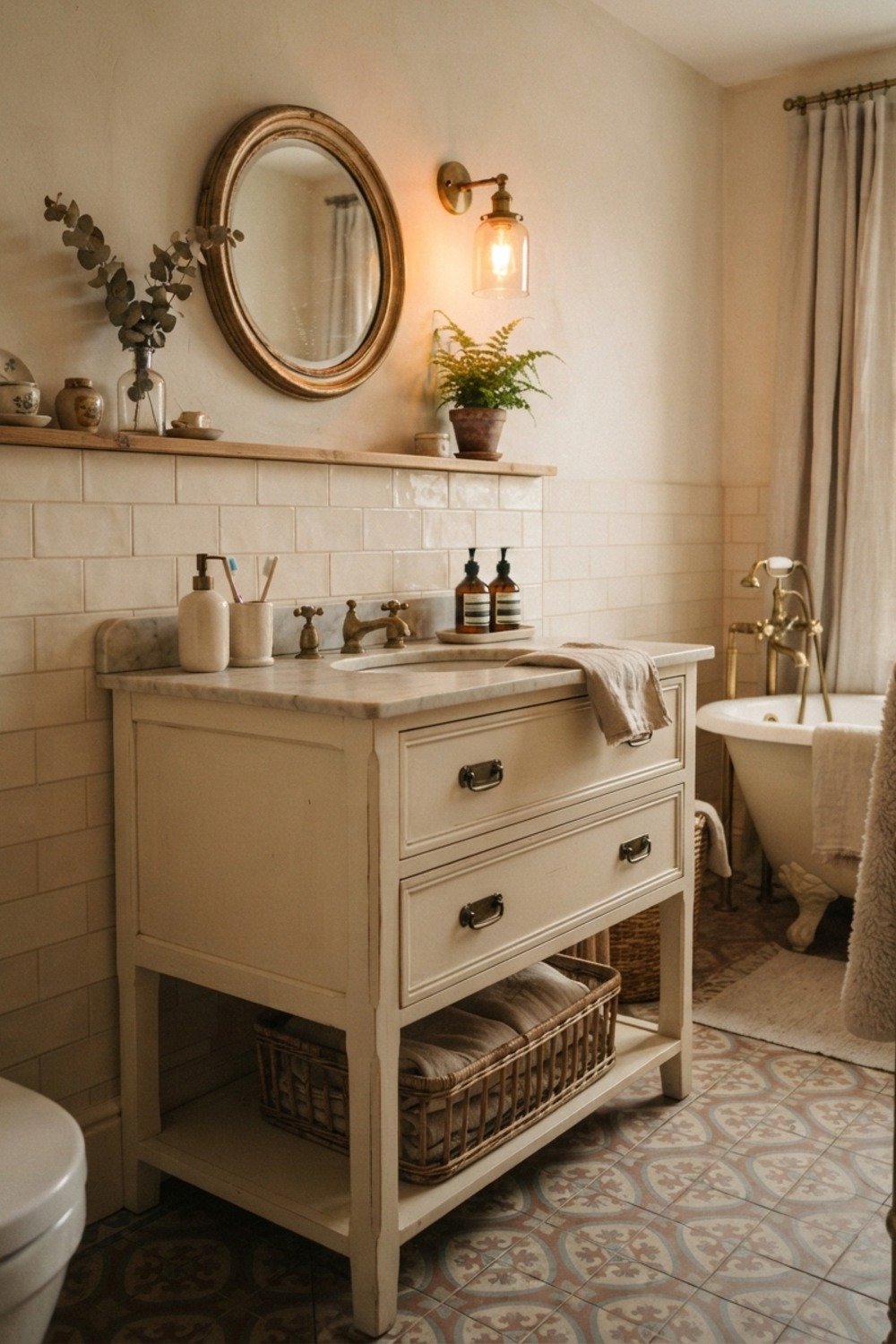
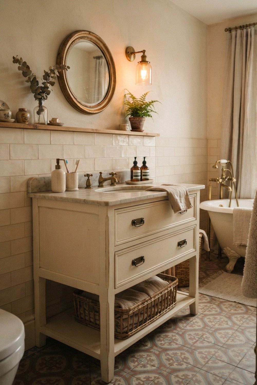
1. Soft white with a creamy base
A true soft white such as Sherwin-Williams Alabaster avoids the gray cast that cheap builder whites pick up in a bathroom. Use it in satin or semi-gloss, because that sheen shrugs off splashes and wipes clean with a damp sponge.
It suits resale prep and anyone with cream or off-white fixtures. Skip stark blue-whites if your toilet is anything but bright white, because the mismatch shows immediately.
2. Greige for the windowless powder room
A small powder room of 20-25 square feet needs a color that doesn’t shrink under a single bulb. Benjamin Moore Revere Pewter is a classic greige that reads as a calm mid-tone rather than a cave.
It works best where the light is artificial and you want a neutral that won’t turn green or pink. Watch the undertone against any existing countertop, since stone with a pink vein will fight a yellow-leaning greige.
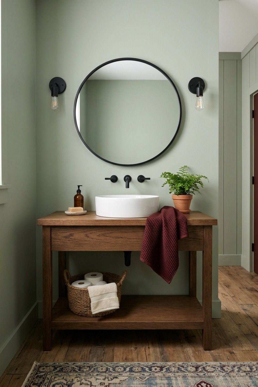
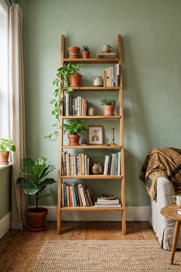
3. Sage green on a budget
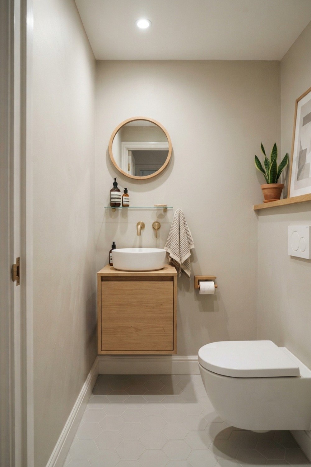
Sherwin-Williams Sea Salt is a gray-leaning sage, and a gallon runs roughly $60-$75, so the whole makeover stays under $100 with tape and a roller cover. That’s real value for a color with this much range.
It flatters white tile and brass or chrome hardware equally. The catch is north-facing light, which pushes it toward gray-blue, so sample it on the wall you’d actually be staring at.
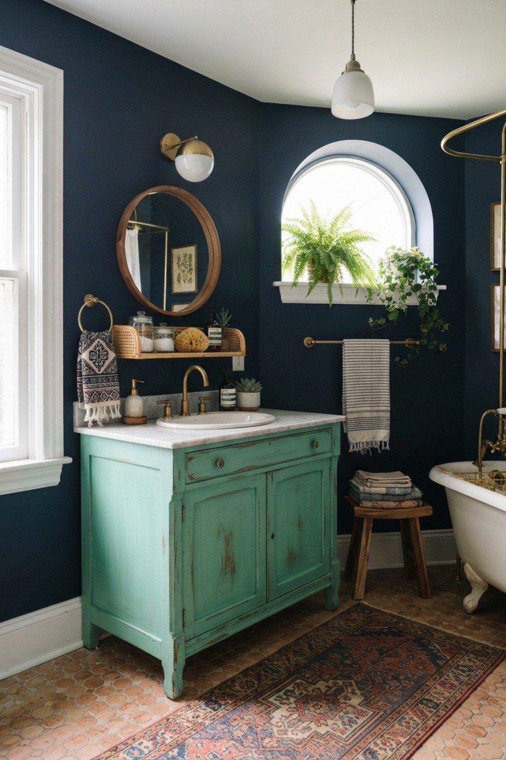
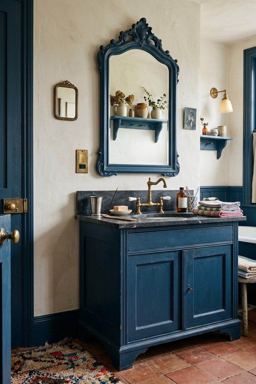
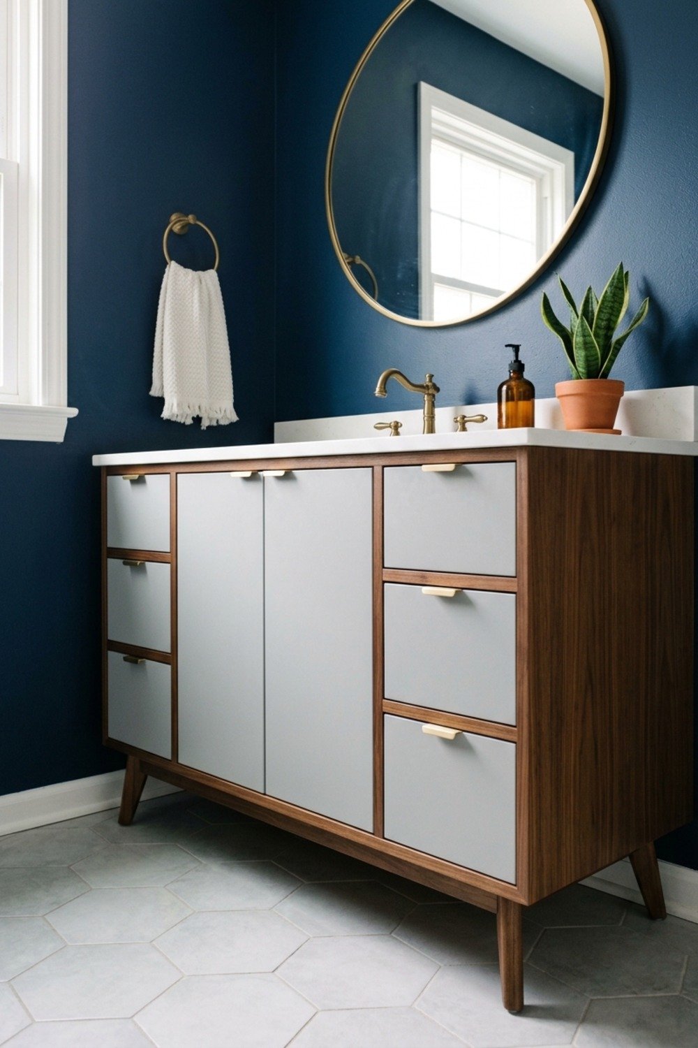
4. Navy on all four walls
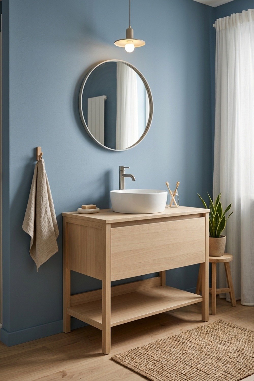
Benjamin Moore Hale Navy in a satin finish wraps a bathroom in color, but it demands a working exhaust fan. Without one, condensation streaks show clearly on dark walls and the finish starts to peel at the seams.
It suits a guest bath with a window and white trim. Plan on two full coats plus primer; navy over a light wall looks patchy after one.
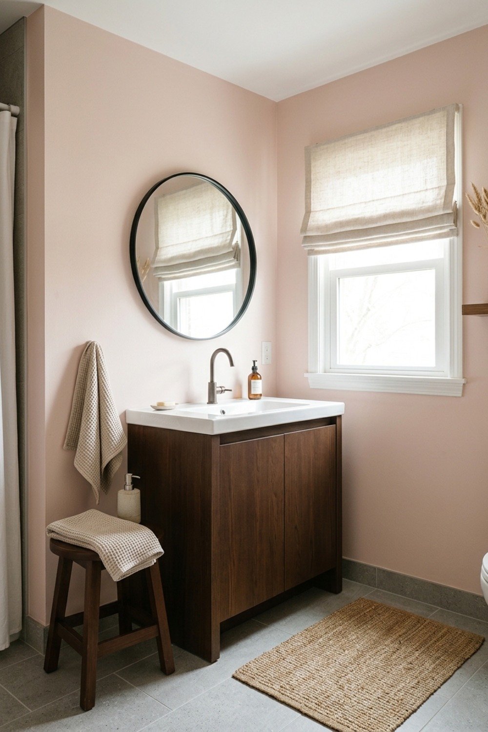
5. Dusty blush, with some caution
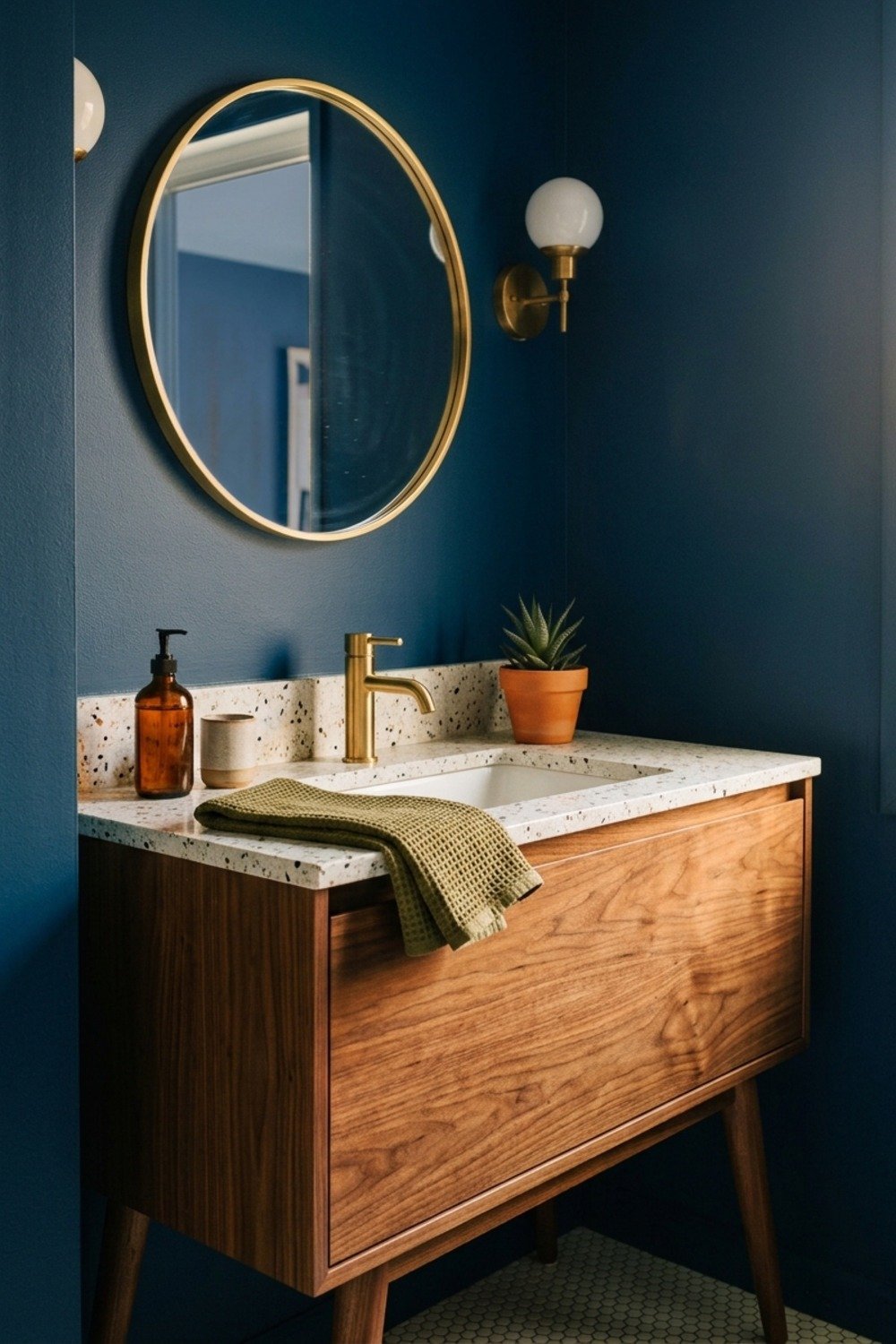
Farrow & Ball Setting Plaster is a muted pinkish neutral that behaves more like a beige than a pink. The loud bubblegum and millennial pinks that flooded bathrooms years ago are the cautionary tale here.
Keep it quiet and it holds up against both brass and black fixtures. The common mistake is going one shade too saturated, which reads dated within two years.
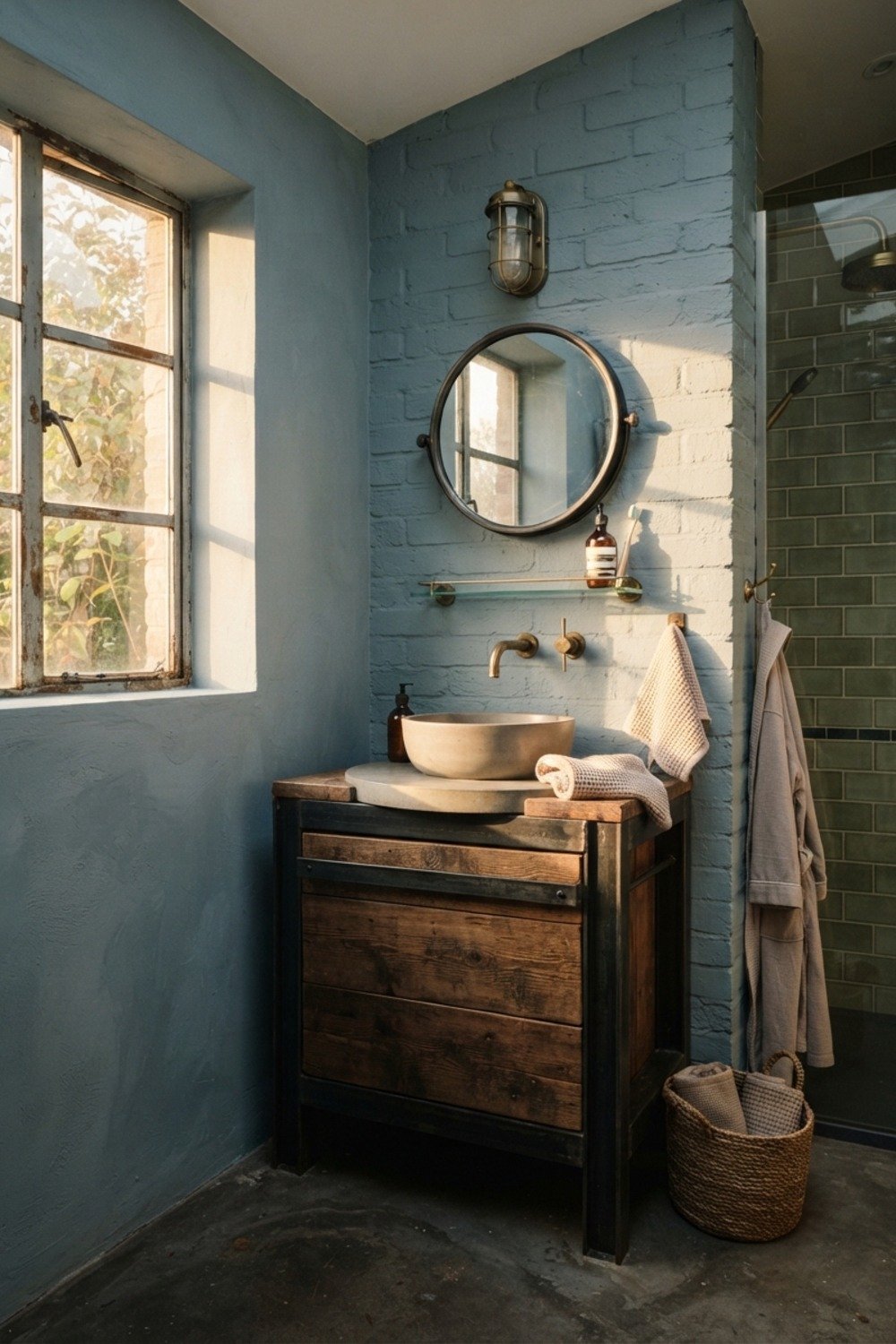
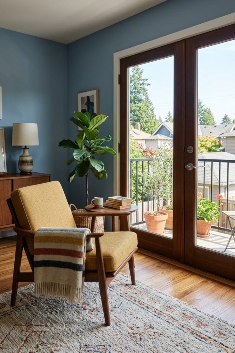
6. Gray-blue that mimics a clear sky
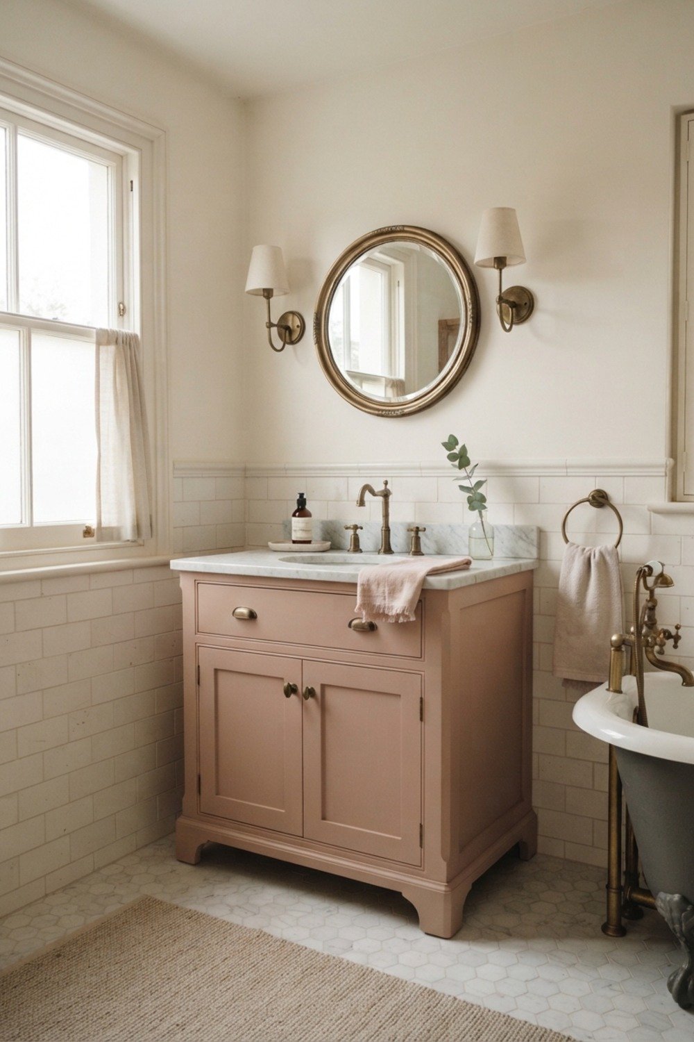
Between blue and green, Benjamin Moore Palladian Blue sits in a spot where it changes through the day. At 4pm, with low sun hitting it sideways, it picks up a faint aqua glow that makes a plain white tub look good.
It’s ideal for south and west bathrooms with plenty of daylight. In a dim room it goes cold and slightly institutional, so avoid it without a window.
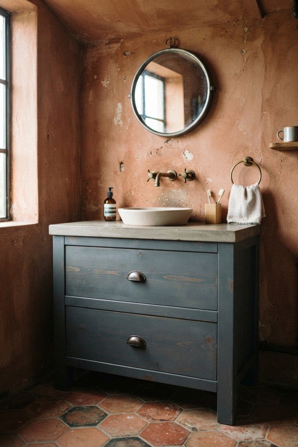
7. Matte black in a tiny powder room
Here’s the counterintuitive part: a very small room, around 3 by 6 feet, often looks bigger in black because the corners disappear. Benjamin Moore Wrought Iron on walls and ceiling blurs the edges completely.
This works for powder rooms only, not a shared family bath. Use a washable matte and keep fingerprints in mind, since dark paint shows every smudge near the light switch.
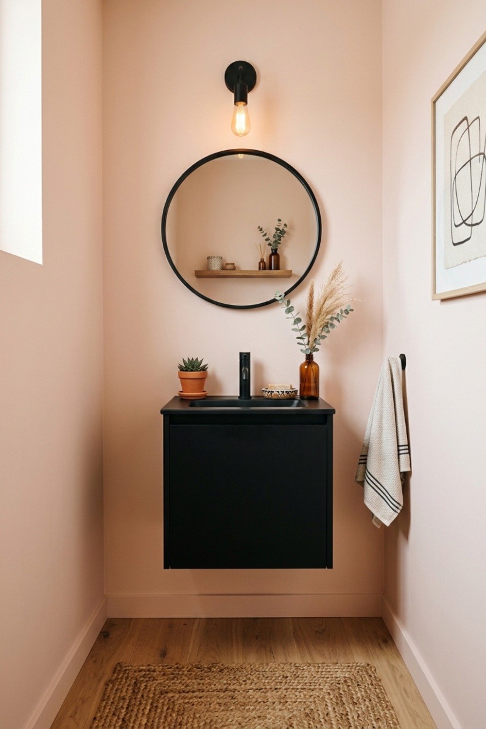
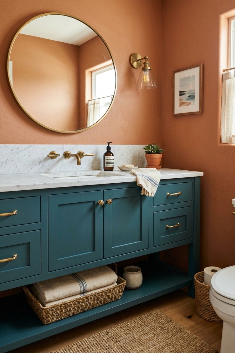
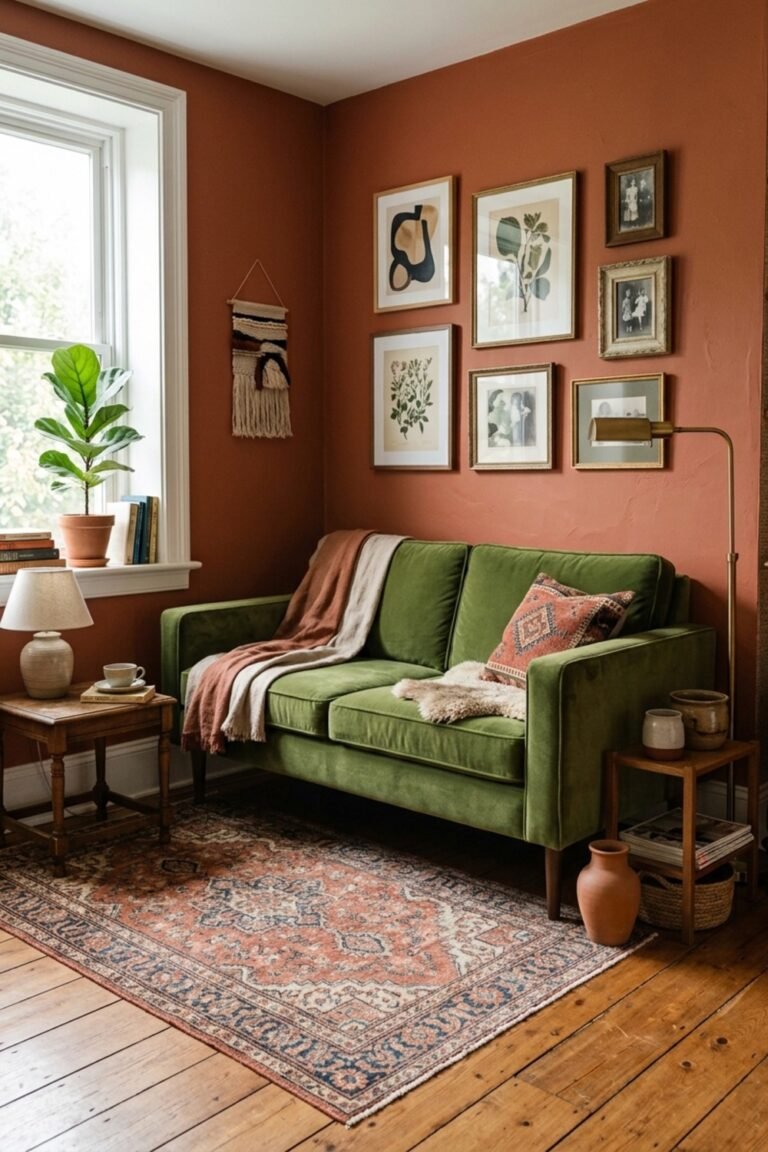
8. Terracotta clay near open shelving
A clay-toned wall behind a pair of 24-inch floating shelves gives folded towels and ceramic jars a backdrop that actually shows them off. White towels against terracotta look crisp rather than lost.
It suits bathrooms with natural wood or woven baskets. Avoid it next to red-toned tile or a salmon-colored tub, where the two warm tones blur into one muddy mass.
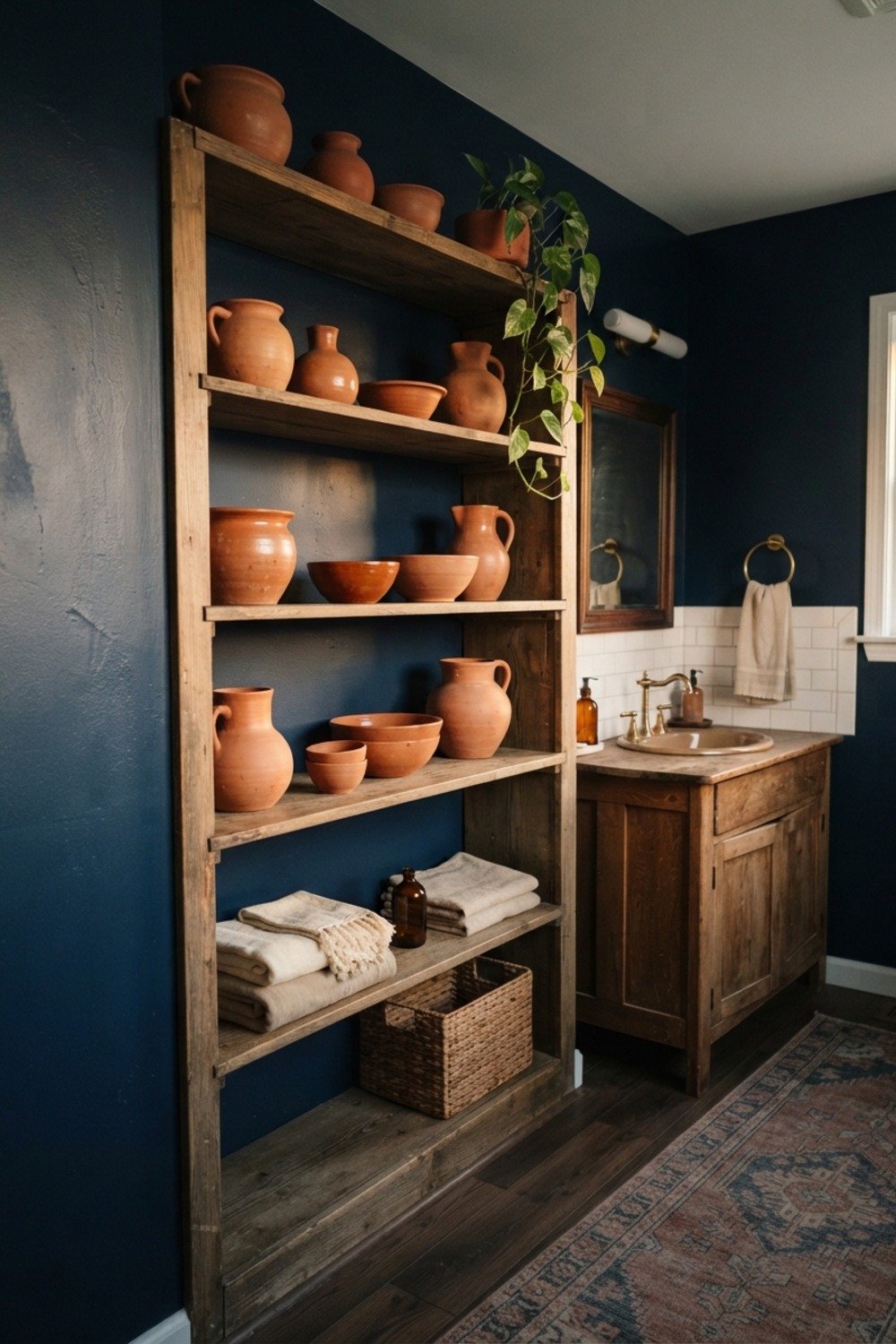
9. Butter yellow with white trim
A pale butter yellow brightens a bathroom without feeling like a nursery, provided the trim stays crisp white. Pair it with a linen shower curtain and a wood stool for a relaxed cottage mood.
It works in older homes with 8-foot ceilings and small windows. Test it in daylight first, since yellow can swing toward mustard once evening bulbs come on.
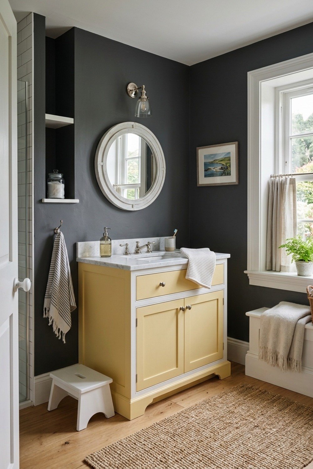
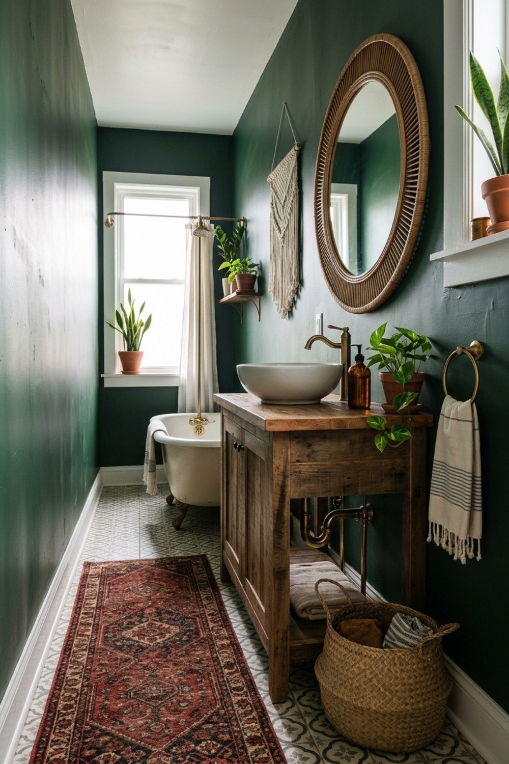
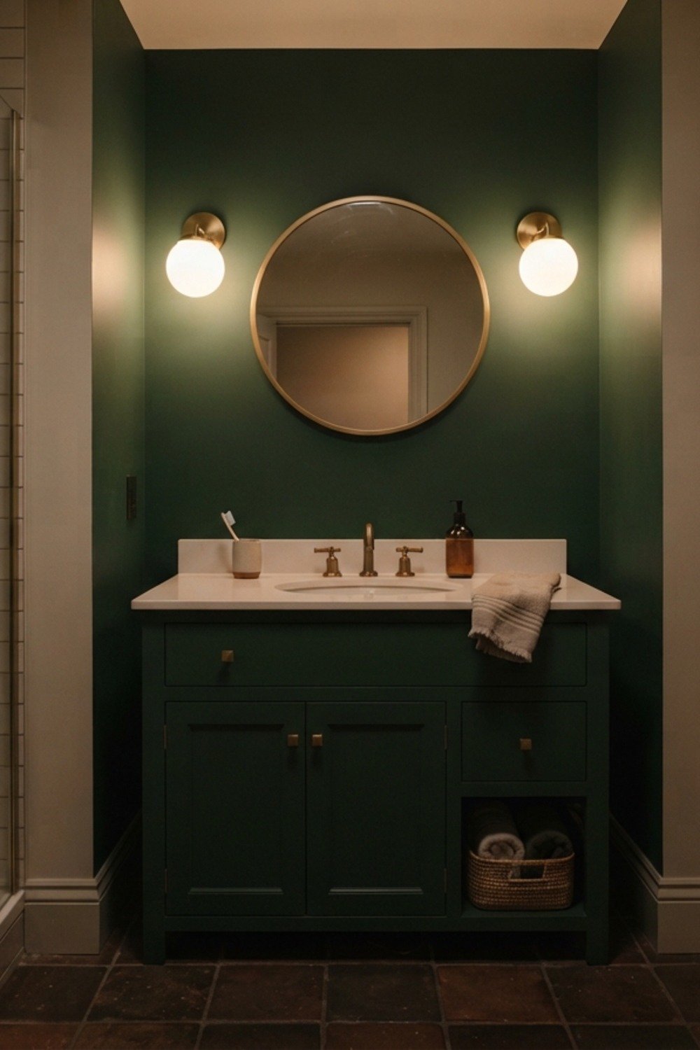
10. Forest green under dim bulbs
A muted green such as Sherwin-Williams Evergreen Fog glows under 2700K bulbs, the amber-leaning kind that flatter skin, because the warm light keeps the depth of the green instead of washing it out. Under cold 5000K lighting, though, it flattens into a dull gray-green.
Choose it for a bathroom with sconces beside the mirror, where the light is soft and sits at face height. Swap overhead bulbs before judging the color, because the wrong bulb makes the right paint look wrong. Test a sample at night too.
11. Seafoam for a satin finish
In a bathroom with only a small frosted window, pale seafoam in eggshell or satin reflects light off its slightly sheened surface and brightens the room. Cheap flat paint here would soak up what little light there is.
It suits coastal homes and anyone with white subway tile. The mistake is a version with too much blue, which turns a bathroom into a swimming pool.
12. Lavender gray in a small space
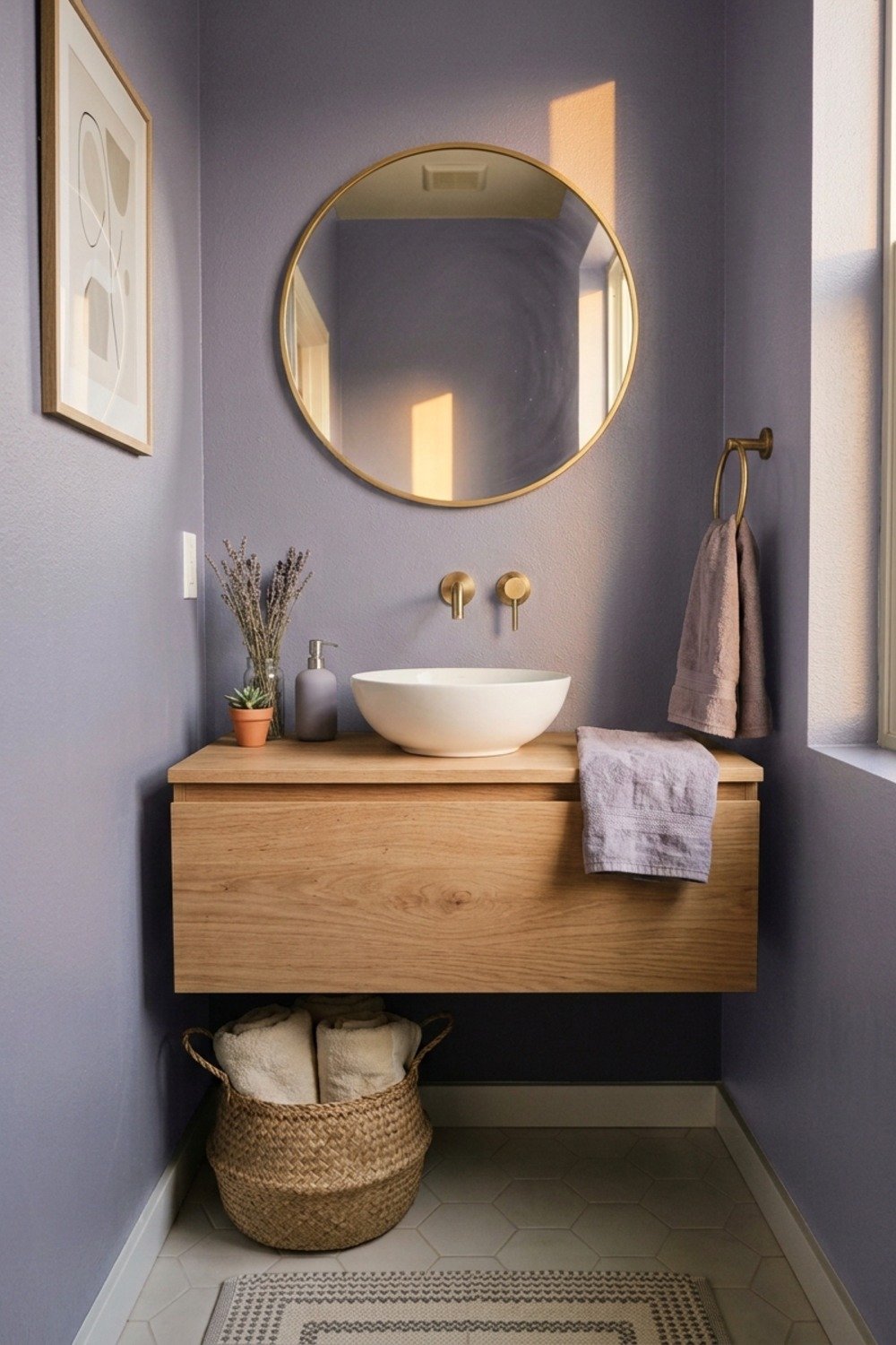
A gray with a faint violet undertone feels softer than plain gray, and in a 40-square-foot bathroom it keeps the walls from looking flat. It’s forgiving next to chrome fixtures and cool white tile.
Keep the lavender barely there. At full strength it turns the room playful, and the color you tolerated in a sample may exhaust you across 120 square feet of wall.
13. Two-tone with a dark lower half
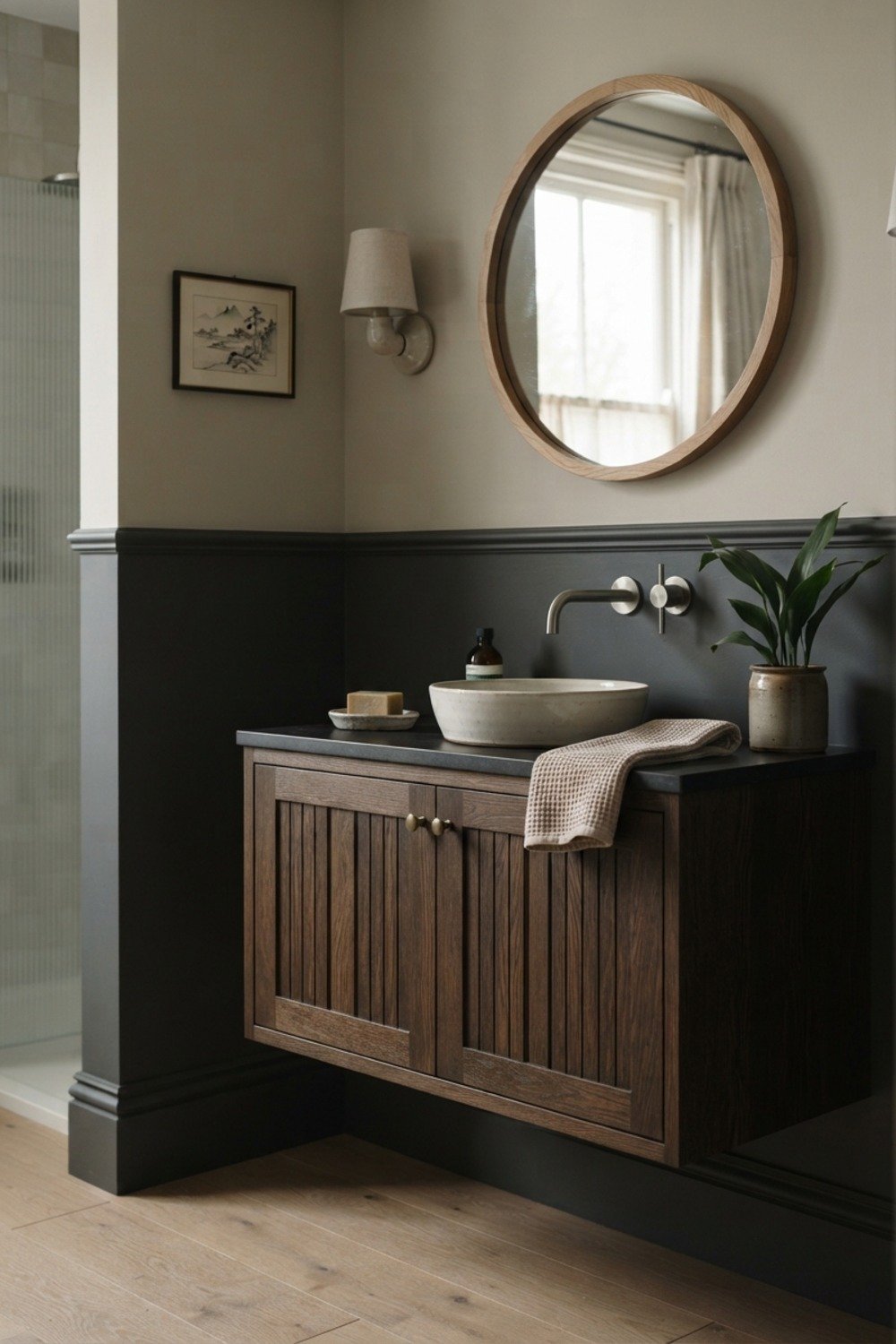
Painting the lower 36 inches in a dark shade and the upper walls in a pale one costs about the same as one color, but the dark section hides splash marks. A thin trim line at the join finishes it cleanly.
It fits older bathrooms and kid baths that take abuse. Measure the line with a laser level; a wobble of even half an inch is obvious against a long wall.
14. A sky blue ceiling
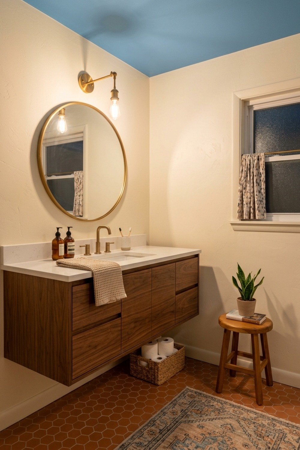
Overhead, a pale haint blue, like Farrow & Ball Hague Blue lightened by half, reads as a soft glow and helps a bathroom with a low 7-foot ceiling feel open. It has a long Southern porch tradition behind it.
Pair it with white walls to keep it calm. Use a flat ceiling paint rather than satin, which highlights every roller mark overhead.
15. White walls, charcoal vanity
Painting a tired vanity charcoal is a $40 fix, and the dark color makes white walls look crisper by contrast, but only if the surface is prepped. Sand it, then use a bonding primer, or the paint peels off the damp cabinet face within a year.
The idea suits a rental-adjacent budget or a dated oak vanity whose frame and doors are still sound. Skip it on laminate that’s already bubbling, since paint can’t fix swelling. Use a durable cabinet enamel rather than wall paint for the finish.
16. Olive and moss tones
Yellow-green olive gives a bathroom an earthy backbone that works with aged brass and travertine, because its brown undertone echoes the warm metal and stone. It looks right beside a wooden mirror frame in a way gray never will.
It’s best for bathrooms with natural stone, where the paint can pick up the veining or the honed finish. Keep the saturation low; a brighter lime-leaning olive screams 1970s kitchen appliances. Hold a swatch against the tile before buying a gallon.
17. Mushroom taupe for long, narrow layouts
A galley bathroom, say 5 feet wide and 10 feet long, benefits from a taupe that doesn’t draw the eye to the far wall. A single quiet color on every surface stretches the sightline.
It suits shared bathrooms where a bold choice would divide opinion. The pitfall is a taupe with too much red, which goes brownish under yellow bulbs.
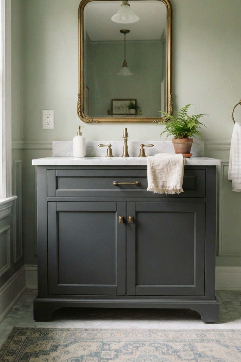
18. Apricot behind a towel ladder
A faded apricot wall behind a freestanding ladder rack makes cream and gray towels stand out, since the soft warm backdrop contrasts with the cooler neutrals. Folded stacks become part of the decor instead of clutter.
It’s a good pick for bathrooms without a linen closet, where towels have to live in plain sight. Keep it chalky; a saturated orange-peach makes skin look sunburned in the mirror. Check the shade under the vanity lights before committing.
19. Deep teal with brass
Deep teal and unlacquered brass is a pairing that has held up for decades in both Victorian and modern homes. Add a black-framed mirror and the bathroom has a clear point of view.
It works in bathrooms with 9-foot ceilings that can carry the weight. Stick to a small amount of pattern, since a teal wall plus busy tile gets loud quickly.
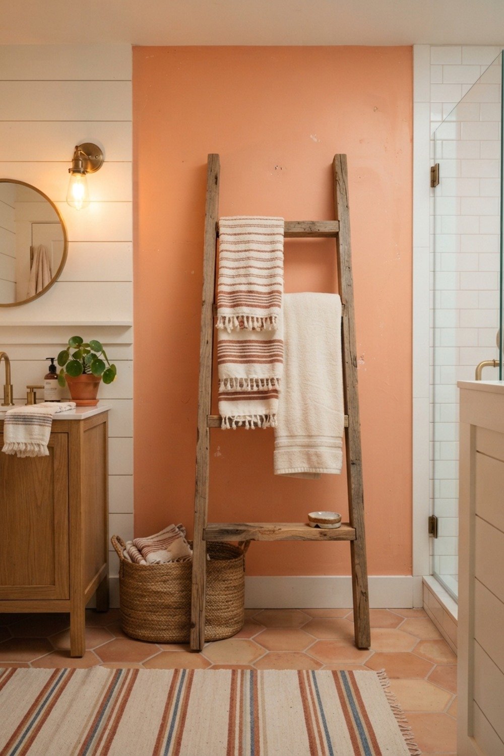
20. Limewash in a warm white
Limewash gives walls a faintly cloudy surface that catches window light unevenly, so the wall seems to shift at 4pm. Brands like Portola Paints sell it at roughly $60-$100 a gallon, more than standard wall paint, and the brushed look needs crisscross strokes.
It suits bathrooms with a good window and low humidity, such as a powder room or a guest bath. Seal it where it meets the shower, since limewash is porous and stains from splashes. A matte sealer keeps the chalky depth intact.
21. Color drenching in ink blue
Painting walls, trim, and ceiling in one shade removes the visual breaks that make a small room feel chopped up. Use a semi-gloss on trim and a lower sheen on walls for subtle depth.
It’s right for confident owners with a bathroom under 45 square feet. The risk is fussy prep: every edge, caulk line, and switch plate has to be clean, since there’s no white trim to hide behind.
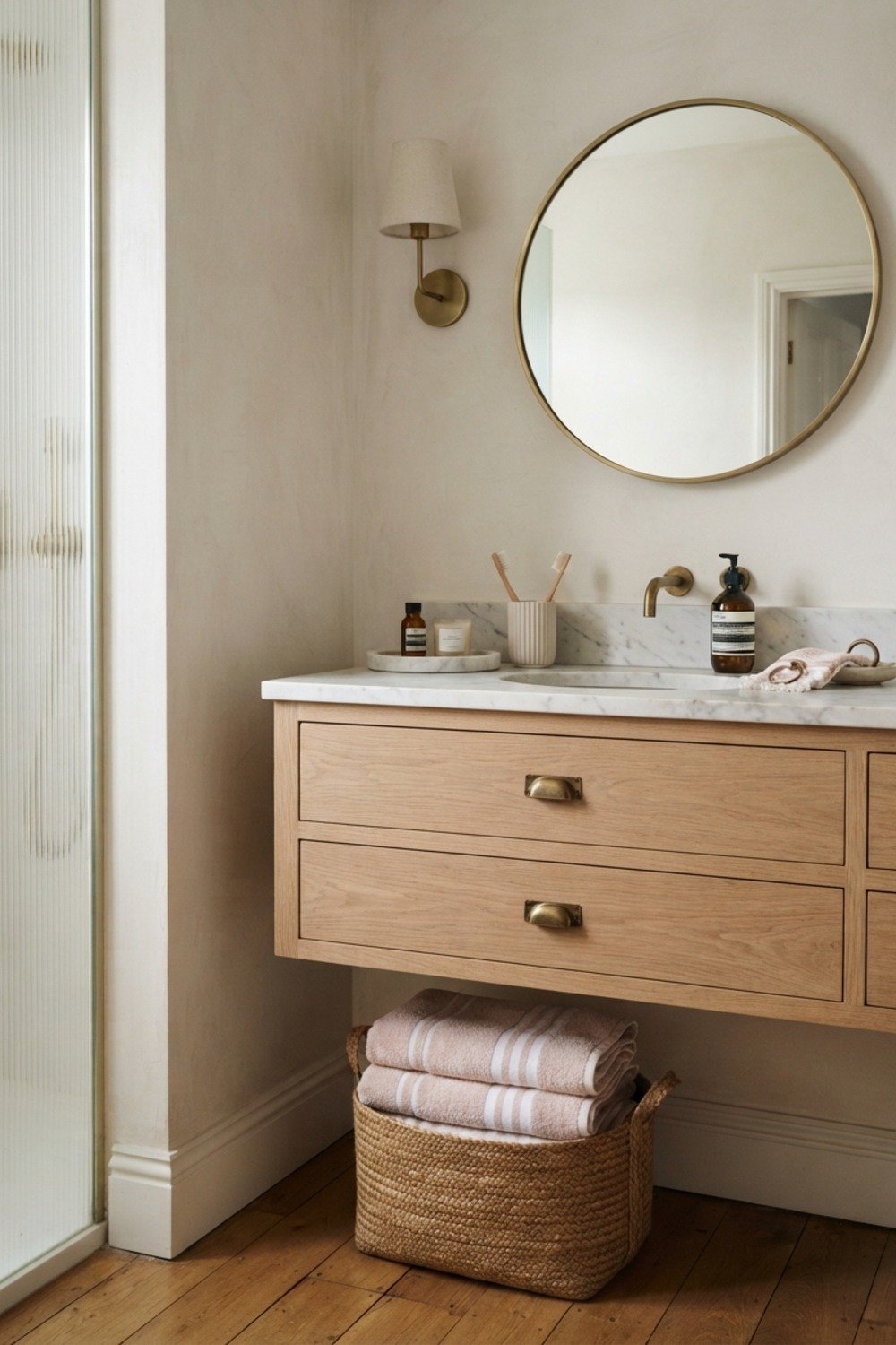
22. Celery green in a tight bathroom
Tucked into a 4 by 7 foot bath, a pale yellow-green has a fresh, garden quality that keeps the room from feeling boxed in. It reflects daylight without the sterile glare that a pure white gives, so a small room reads airy rather than clinical.
It suits homes with oak or maple floors, whose golden tones sit comfortably beside the green. Avoid it with pink-toned tile, which turns both colors sickly. Tape a swatch next to the tile and check it at noon and at dusk.
23. Chocolate brown for a modest budget
A dark brown like Benjamin Moore Kendall Charcoal’s browner cousins costs the same as any other shade, but it hides old, slightly grimy grout lines visually, because deep color flattens contrast between tile and joints. It makes a dated bath look intentional.
It’s best for a bathroom you plan to renovate in five years, when a cheap gallon buys a moody update. Think carefully before painting over it later, since dark colors need primer to hide. Budget for a tinted primer and two extra coats.
24. Light gray that hides fingerprints
A light gray with a blue lean, such as Benjamin Moore Gray Owl, has a midtone surface that doesn’t show water spots the way pure white does, since droplets and dust blend into the color.
It’s a practical pick for a bathroom the kids use daily, and it works in busy family homes where nobody wipes the walls after every use. Pick a scrubbable satin so toothpaste splatter wipes off in one pass. Avoid flat paint, which scuffs and holds stains near the sink.
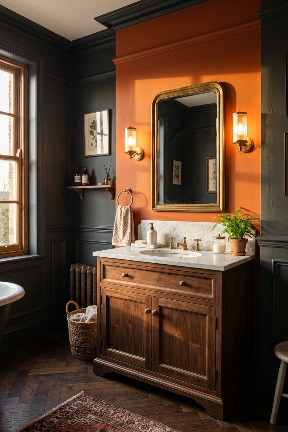
25. Burnt orange behind the vanity
A single accent wall in burnt orange is a common move that rarely survives. When the accent stops at the corner it looks like a sample left half done, and the color fights with the mirror reflection, casting an orange glow on faces.
If the idea appeals, paint the whole room instead, which suits a larger bath with enough wall to carry a deep tone. Otherwise, restrict that orange to a door or towels you can swap out. Either way, test a large swatch first, since burnt orange shifts under warm bulbs.
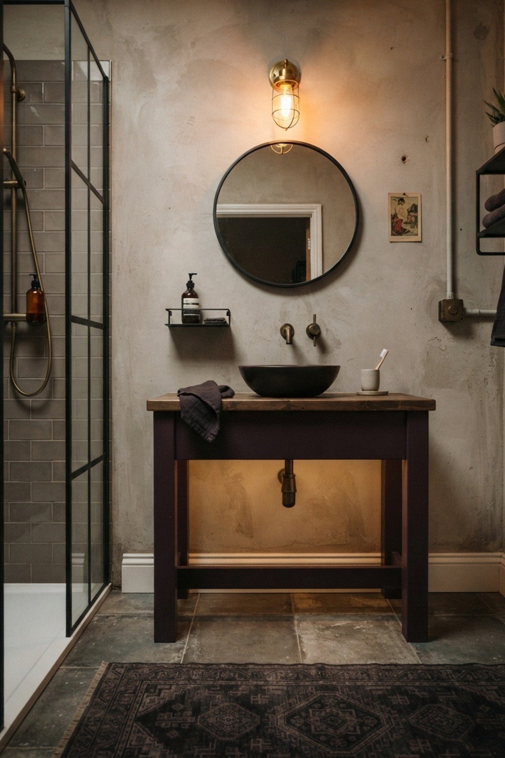
26. Aubergine for moody evenings
A plum shade like a dusty aubergine looks best with candles, and it makes a soaking tub feel like a retreat. It also flatters gold mirrors and white marble.
It suits a primary bath used mostly after dark. In a bathroom with strong afternoon sun, the same color can look flat and slightly purple-brown, so test it at both times.
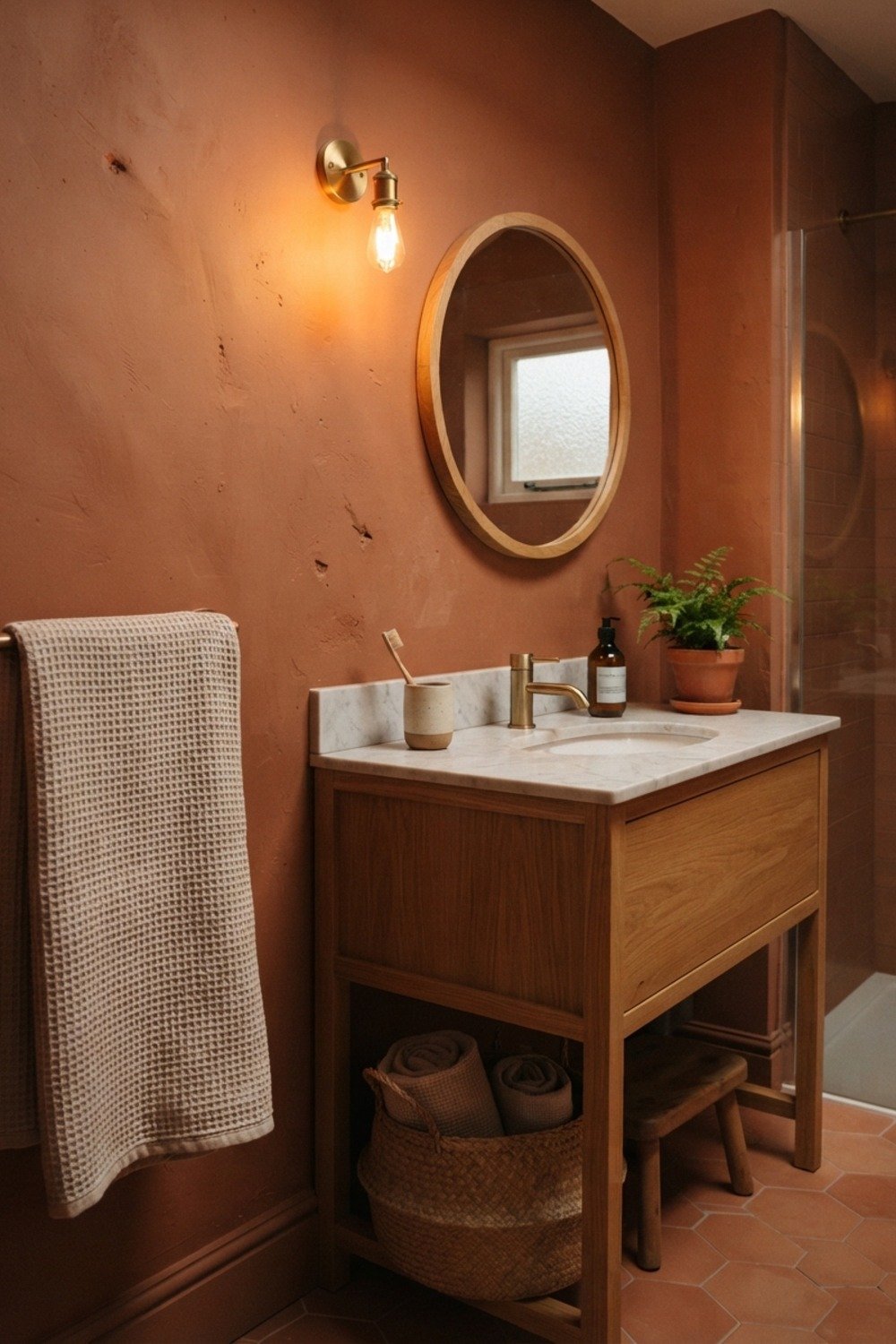
27. Ivory beside natural wood
A warm ivory with a walnut vanity or oak shelf makes the wood look richer without any extra work, since the light neutral gives the grain contrast. The paint recedes and the grain does the talking.
It’s the safe choice for bathrooms with a teak bath mat or bamboo accessories, where several wood tones need a calm backdrop. Avoid a yellow ivory against cool gray tile, which makes the floor look dirty. Pick an ivory with a touch of beige instead.
28. Oxblood for a dramatic powder room
When the sconces come on, a dark red like oxblood glows, which is why it shows up in old library and hotel powder rooms. A small mirror and gold fixtures finish it quickly.
It needs a room with a door you can close, since nobody wants it spilling into a bright hallway. Use a matte or eggshell finish; high gloss on red looks like lacquered toys.
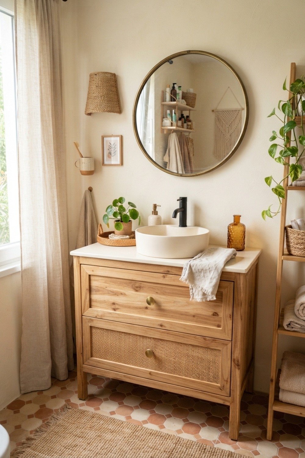
How it all comes together
Picking from these 28 Bathroom Paint Color Ideas is half the job. The other half is testing, because bathroom light changes with the tile, the mirror, and the bulbs.
- Paint two 2-foot squares on different walls, one near the window and one near the mirror.
- Look at them at 9am, 4pm, and with the lights on at night.
- Hold your towels, tile sample, and hardware finish up against each square.
- Choose satin or semi-gloss for wet walls, and eggshell for a powder room.
On a gray February afternoon, a color that looked fresh in July can read as cold. That’s why testing in the weakest light matters most.
By the second coat, you’ll know whether the shade holds up. Dark colors especially show roller streaks at that point, so keep a wet edge and don’t overwork the paint.
Wait.
Give each coat a full 4 hours before the next, and run the exhaust fan for 24 hours after finishing so the paint cures properly.
Small details, big impact
The early mistake is chasing whatever color dominates social feeds that season. Bathrooms are repainted far less often than living rooms, so a trendy shade is locked in for years, and that’s when it starts to look dated.
Durable choices share a pattern: muted undertones, a finish that handles moisture, and a palette that lets towels and art do the seasonal work.
- Using flat wall paint near the shower, which stains and mildews fast.
- Skipping primer over a dark color, which costs an extra coat or two later.
- Ignoring the fixed tile color, then wondering why the walls look off.
- Painting over peeling spots without scraping and sanding first.
Fix those four and most paint jobs last 7-10 years instead of 3.
Picking your shade and getting started
The 28 Bathroom Paint Color Ideas above cover every size and lighting situation, from a windowless powder room to a sunny primary bath. Neutrals and muted greens give the longest life, while the dramatic shades reward confident owners in small, closable rooms.
Save or pin this list so it’s ready when you start. Then pick one idea, buy a sample pot for $5-$9, and test it on two walls before you buy a full gallon.
Frequently Asked Questions
What is the best paint finish for a bathroom?
Satin or semi-gloss is the safest choice for walls near the tub, shower, and sink. These finishes resist moisture and wipe clean. A powder room without a shower can handle eggshell.
How much does it cost to paint a bathroom?
Expect $70-$100 for a DIY job, covering one gallon of paint, primer, tape, and a roller cover. A professional painter typically charges $250-$500 for a standard bathroom. Dark colors cost more in time because they need extra coats.
Which of the 28 Bathroom Paint Color Ideas works best in a small bathroom with no window?
Soft white, greige, and pale sage are the easiest picks for a windowless room. If you want drama, matte black can also work in a powder room under 25 square feet. Test it under your actual bulbs before buying.
Can I paint over bathroom tile?
Yes, but it needs a degreaser, light sanding, and a bonding primer, followed by epoxy or tile paint. Expect it to wear faster than the walls, especially in the shower. It’s a decent short-term fix for floors and backsplashes but not for a wet tub surround.