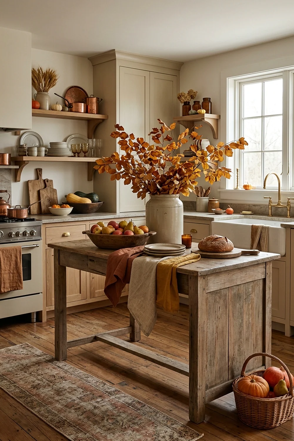
Which colors make a kitchen feel like October without tipping into a pumpkin-patch costume? Autumn kitchen decorating works best when one saturated, earthy color leads and everything else stays quiet. The 31 palettes below come with paint names, so choosing takes an afternoon instead of a month.
Each entry covers why the pairing works, which kind of kitchen suits it, and what to watch for. Skim the headings, pick two or three that match your light, and sample them before buying a gallon.
The color logic behind great autumn kitchen decorating
Autumn kitchen decorating gets easier once a palette is sorted by undertone instead of by name. Nearly every good fall scheme uses one saturated earth color, one pale neutral that shares its undertone, and one dark anchor.
Repeat each color at least twice around the room. A rust on the cabinets and again in a runner feels planned, while a single rust object feels like a mistake.
- Yellow-based: ochre, mustard, honey oak, cream. These glow brightest in low sun.
- Red-based: terracotta, rust, burgundy, brick. These need a neutral with a hint of pink or clay.
- Green-based: olive, moss, bottle green. These pair with brass, walnut, and anything copper.
Here’s the counterintuitive part. In a small, dim kitchen, a deep color on every wall can feel larger than a pale one, because the corners dissolve and the eye stops measuring the box.
Light matters just as much. A north-facing kitchen turns most colors grayer by about 4pm in October, so it needs paints with more yellow or red in them than they seem to need in the store.
1. Cavern Clay lower cabinets with soft white uppers
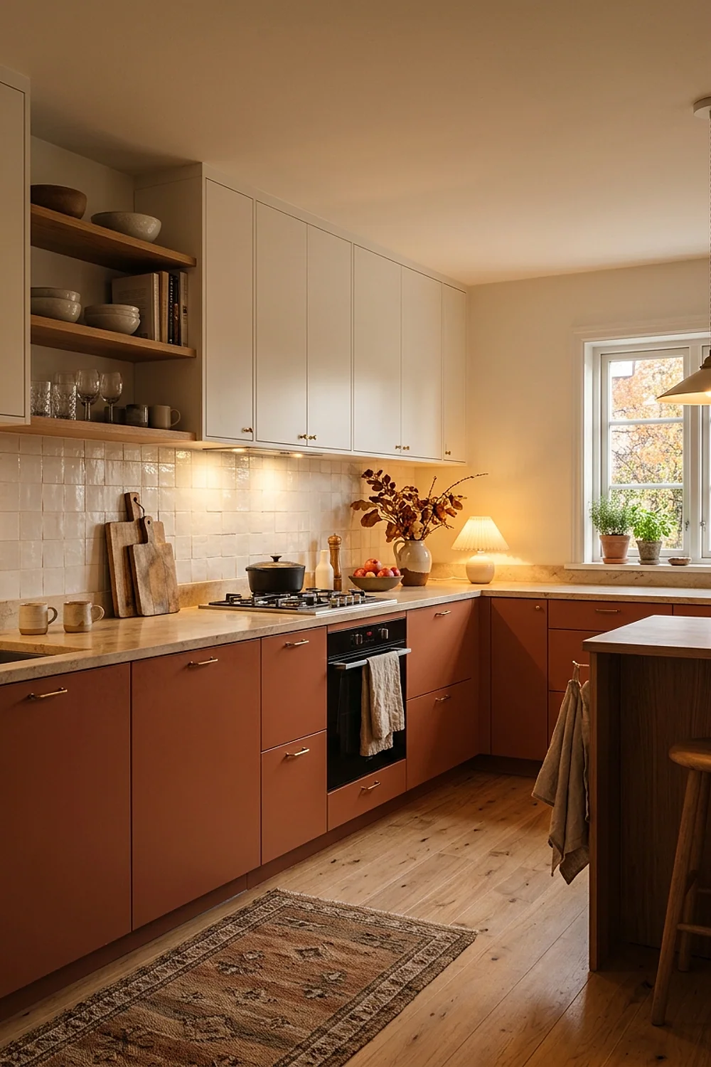
Sherwin-Williams Cavern Clay is a terracotta with a brown backbone, so it looks like baked earth instead of orange. Used on lower cabinets only, it anchors the room the way a rug anchors a living room. Sherwin-Williams Alabaster, a soft white that leans slightly yellow, keeps the uppers light.
This split suits galley kitchens under 100 square feet, where color stays low and the walls don’t close in. Skip it under 5000K cool-white bulbs, which strip the red and leave a flat peach.
On the upkeep side, terracotta in a satin enamel hides splatter far better than white ever will, and a damp cloth handles most of it.
2. Unlacquered brass pulls on a Hale Navy island
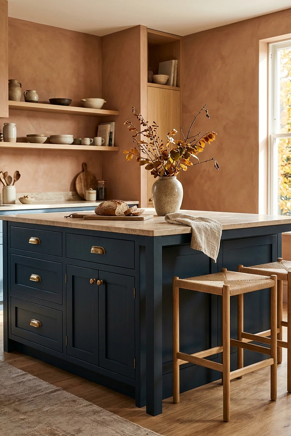
Navy and rust sit opposite each other on the color wheel, which is why a Benjamin Moore Hale Navy island looks so settled beside terracotta or pumpkin accents. The metal does the bridging. Unlacquered brass pulls, about 5 inches center to center, darken into a brown-gold within a few months.
That patina is the whole appeal for a lived-in kitchen. But anyone who wants bright brass will be polishing monthly, so lacquered pulls are the honest choice for that person.
3. Open shelves in Evergreen Fog behind stacked stoneware
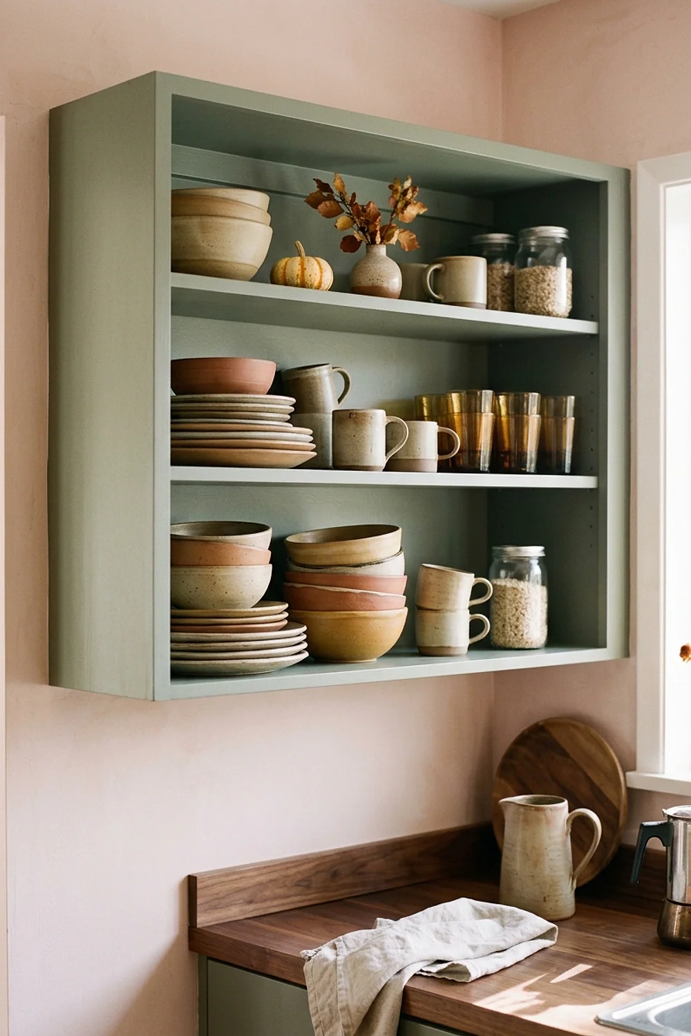
Sherwin-Williams Evergreen Fog is a gray-green with enough smoke in it to feel like late-afternoon woods. Painted inside or behind open shelves, it makes cream and oatmeal stoneware stand out without any fuss. Shelves 10 inches deep hold dinner plates and mugs comfortably.
The trade-off is grease. Shelves within 4 feet of the range collect a sticky film, so keep dry goods and pottery there and wipe the boards every couple of weeks.
4. Three muted pumpkins on a board against Green Smoke
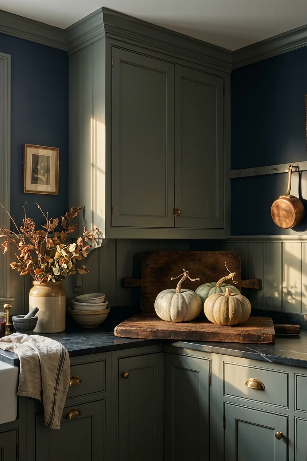
Farrow & Ball Green Smoke is a murky blue-green that makes rust and cream pumpkins look expensive. Group three on a butcher block or a wooden board, varying the heights by 3 to 5 inches, and stop there. Odd numbers read as gathered; even numbers read as lined up.
Choose blue-gray, cream, and one burnt orange rather than three oranges. Uncut pumpkins last six to eight weeks on a dry counter, but any soft spot means they go straight to the compost.
5. Brinjal on a single wall, about a third of the color

Nearly black at night and aubergine at noon, Farrow & Ball Brinjal is a plum-brown with a shifting personality. Painted on one wall, such as the one behind a banquette or hood, it fills roughly a third of the room’s color weight, which is the proportion that feels intentional.
Painted on all four walls of a kitchen with one small window, it will swallow the light. Keep the ceiling and trim pale and let that single wall carry the mood.
6. Rust, ochre, and brown instead of one loud orange
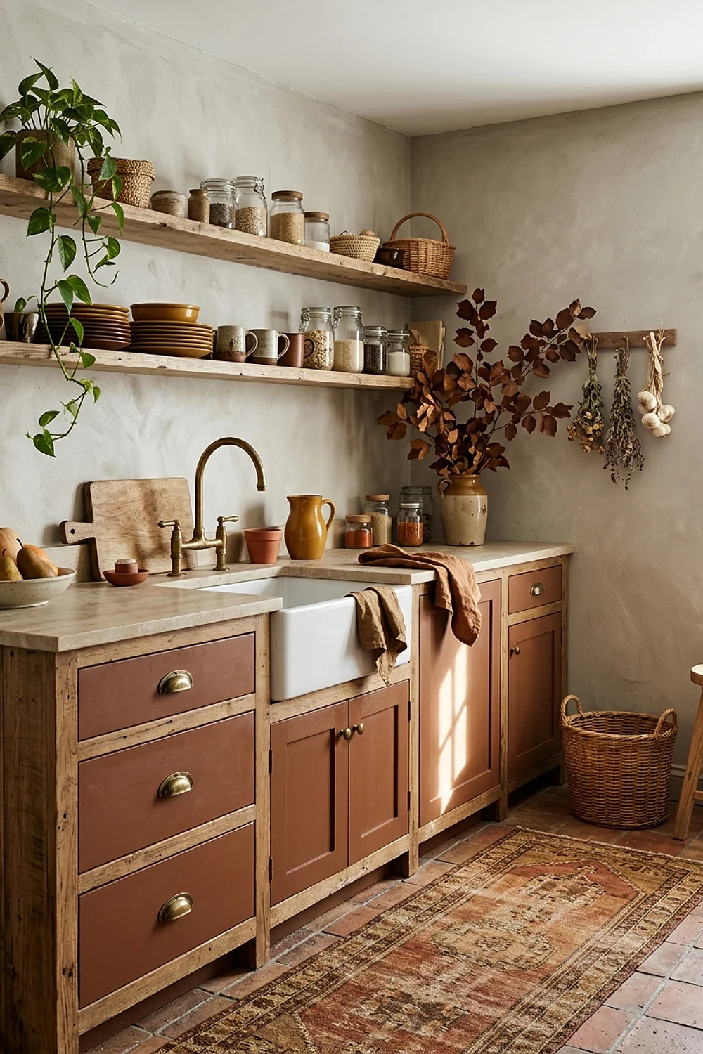
The common mistake is matching every autumn accent to the same orange. A pumpkin backsplash, orange towels, and an orange candle compete for attention and end up looking like a seasonal aisle in a big-box store.
Spread the family instead. Pick a rust, a mustardy ochre, and a chocolate brown, then make each one a different material: a glazed bowl, a linen towel, a wooden board. Texture variety keeps the palette from feeling printed.
7. Urbane Bronze for an island that takes daily abuse
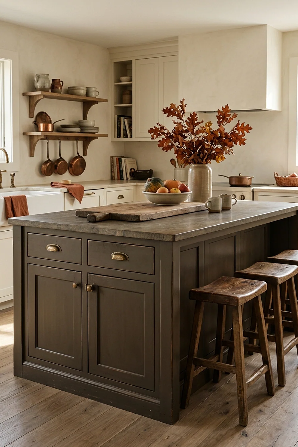
Fingerprints disappear more readily on Sherwin-Williams Urbane Bronze, a gray-brown, than they do on true black. That makes it a smart pick for an island that collects elbows, backpacks, and sticky hands. Choose a semi-gloss or satin enamel, because matte versions show oily smudges within a week.
It suits families and anyone who hates wiping. Against pale oak floors, the island reads as a solid block of chocolate, so keep the perimeter cabinets lighter.
8. Rookwood Red island against putty perimeter cabinets
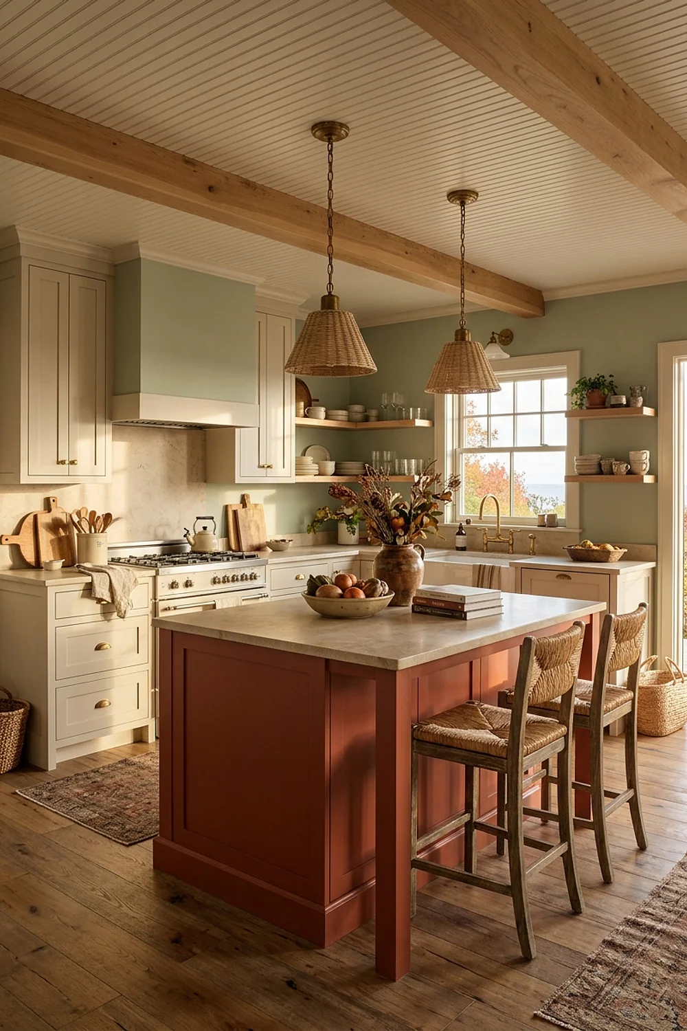
A 36-inch-high island is the one piece in a kitchen that can carry a bold color without overwhelming the room. Sherwin-Williams Rookwood Red, a brick tone with brown in it, looks grounded against a greige such as Benjamin Moore Revere Pewter on the surrounding run.
Use this layout when the kitchen has a clear center and an island at least 24 inches deep. In a galley without one, the red ends up on a wall and the whole thing becomes heavy.
9. Pale Oak walls for the 4pm October sun
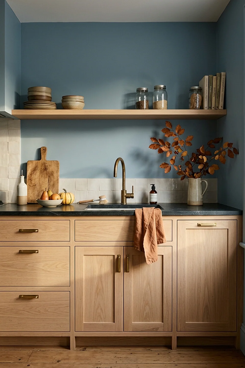
Walls in Benjamin Moore Pale Oak, a soft greige with a faint pink warmth, work because of the light they meet. In late afternoon, when October sun comes in low and amber, the paint picks up a peachy glow that bright whites can’t manage.
It suits west-facing kitchens and open-plan rooms where dinner prep happens at dusk. Pair it with 2700K bulbs. At 3000K or higher, the same walls look like a dentist’s waiting room by evening, so check the box before buying.
10. A wool runner in oatmeal and tobacco stripes
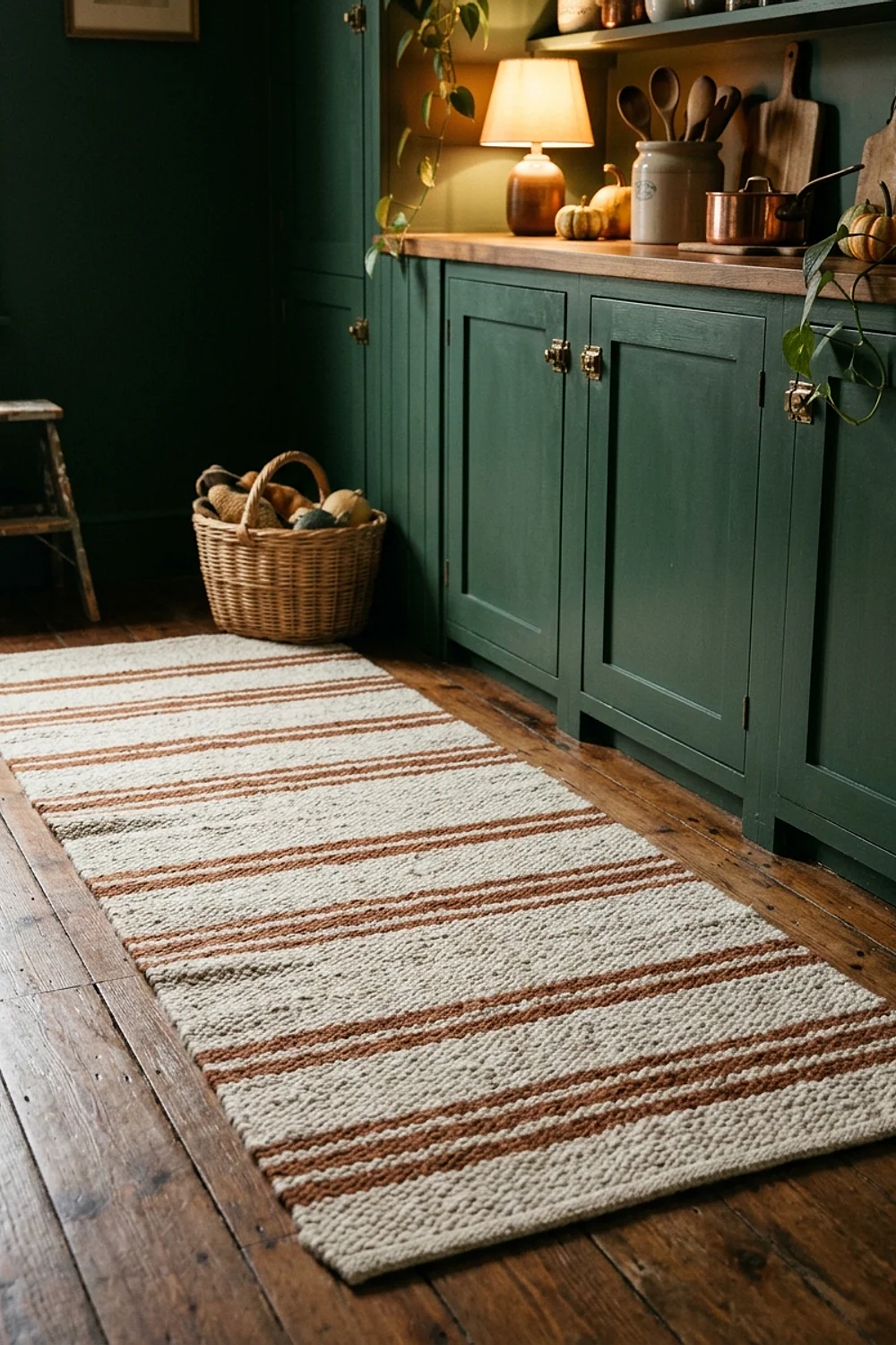
A 2.5 by 8 foot wool runner is the softest color move underfoot, especially on a tile or hardwood floor where a long prep session means standing for an hour. Oatmeal and tobacco stripes tie into both cream cabinets and walnut stools.
Add a rug pad about a quarter-inch thick so the edges lie flat. Wool sheds for the first few weeks, and spills need blotting rather than scrubbing.
Cabinet, wall, and backsplash pairings for autumn kitchen decorating
11. Hollingsworth Green cabinets with a mustard stool

Benjamin Moore Hollingsworth Green is an olive-leaning forest green that looks leafy in daylight and almost black at night. A single mustard stool or a pair of ochre linen towels gives it the contrast it needs.
This works best where the cabinets are the main event and the countertop is pale stone or butcher block. Avoid it with a green-tinted countertop, which turns the whole room into one flat mass.
12. Walnut butcher block against sage cabinets
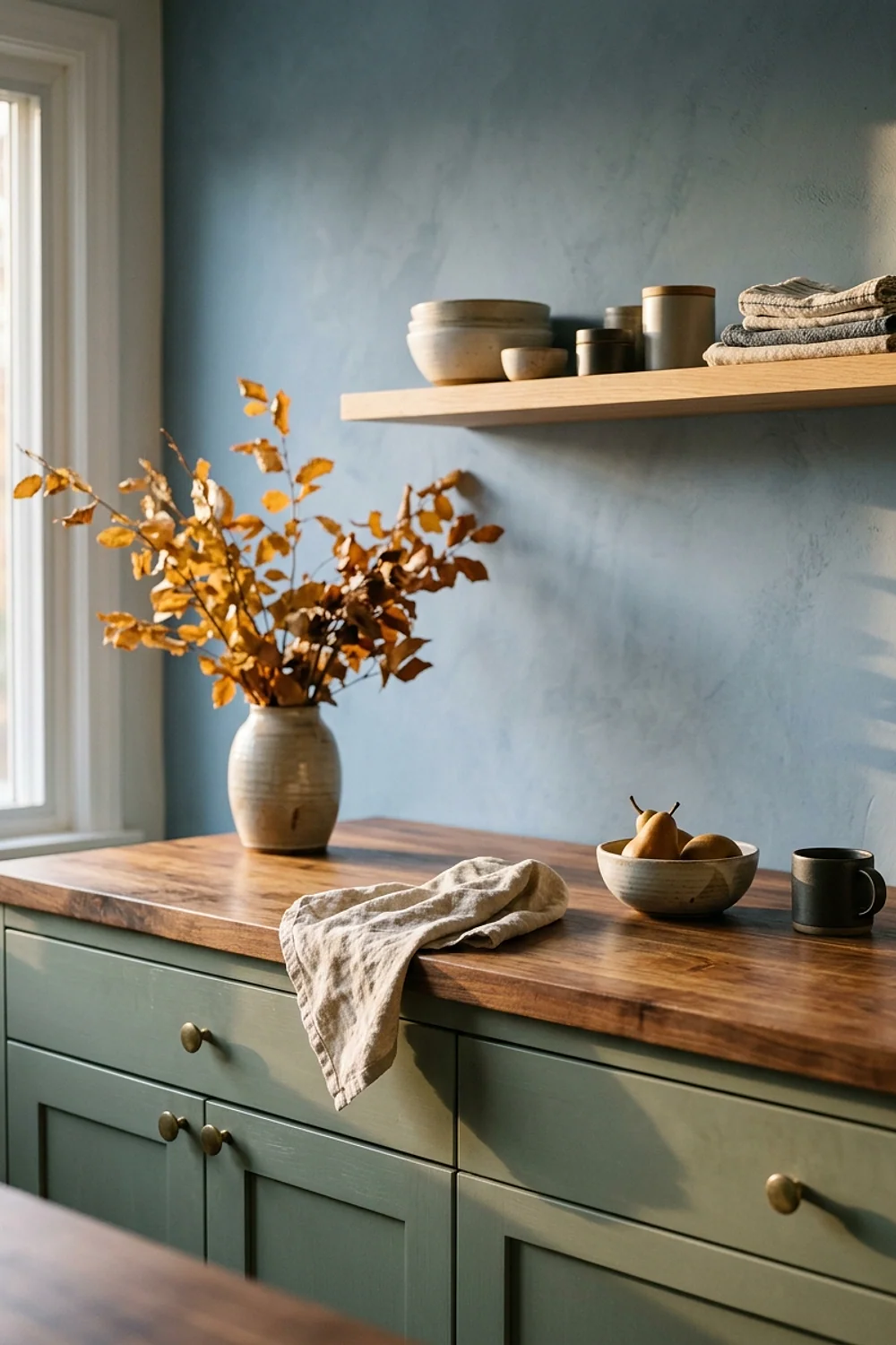
Beside a gentle gray-green like Sherwin-Williams Clary Sage, a 1.5-inch walnut butcher block makes both look better. Wood is the original earth tone, and sage is the leaf that goes with it.
The upkeep is real, though. Raw wood near the sink wants mineral oil every four to six weeks, and a water ring left overnight will leave a dark mark that needs sanding.
13. A copper pot rail over Pigeon walls
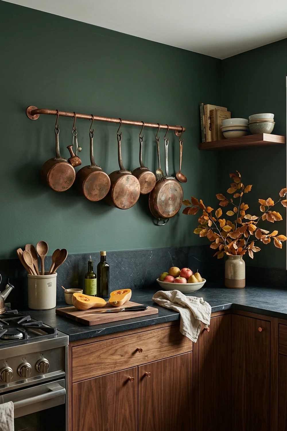
Copper is orange at heart, so it sits across the color wheel from the blue-gray of Farrow & Ball Pigeon and flatters it. A 36-inch rail mounted at eye level keeps the pots within reach and gives the wall a focal point.
Copper tarnishes toward brown unless polished. Anyone who wants a deliberate aged look can leave it alone, and everyone else should budget a few minutes a month.
14. Dried wheat in a stoneware pitcher on Accessible Beige

Dried wheat in a stoneware pitcher glows against Sherwin-Williams Accessible Beige, a greige with a gentle yellow lean, instead of vanishing. Cut the stems 24 to 30 inches tall so the bunch has presence on the counter.
The stems are dry and dusty by November. A hair dryer on its cool setting blows the dust off, and the whole bunch should go in the bin by January.
15. A Setting Plaster ceiling in a low kitchen
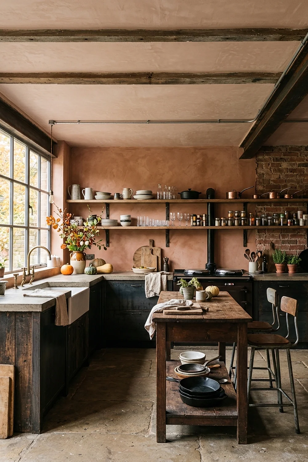
On an 8-foot ceiling, Farrow & Ball Setting Plaster, a dusty pink-brown, bounces a soft glow downward at 4pm. The ceiling is the largest unused surface in most kitchens, which makes it an easy place to repeat a color from the cabinets.
Keep the walls pale, such as Oxford Stone or a cream. A matching ceiling and wall color in a room that small gets close to a shoebox.
16. Kendall Charcoal and copper instead of black and orange
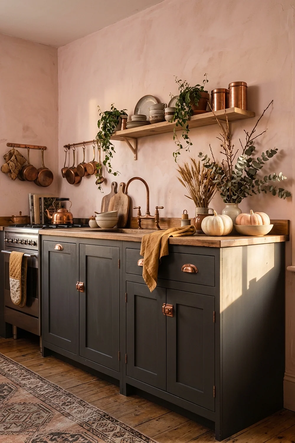
Black and orange is the color scheme of every plastic cauldron in October, and it pushes a kitchen into costume territory. Benjamin Moore Kendall Charcoal, which has brown in it, behaves differently. It reads as soot and timber, not Halloween.
Add copper and cream and the harshness goes away. This is the better route for modern kitchens with flat-front cabinets, where true black can look cold.
17. Glazed rust subway tile behind the range
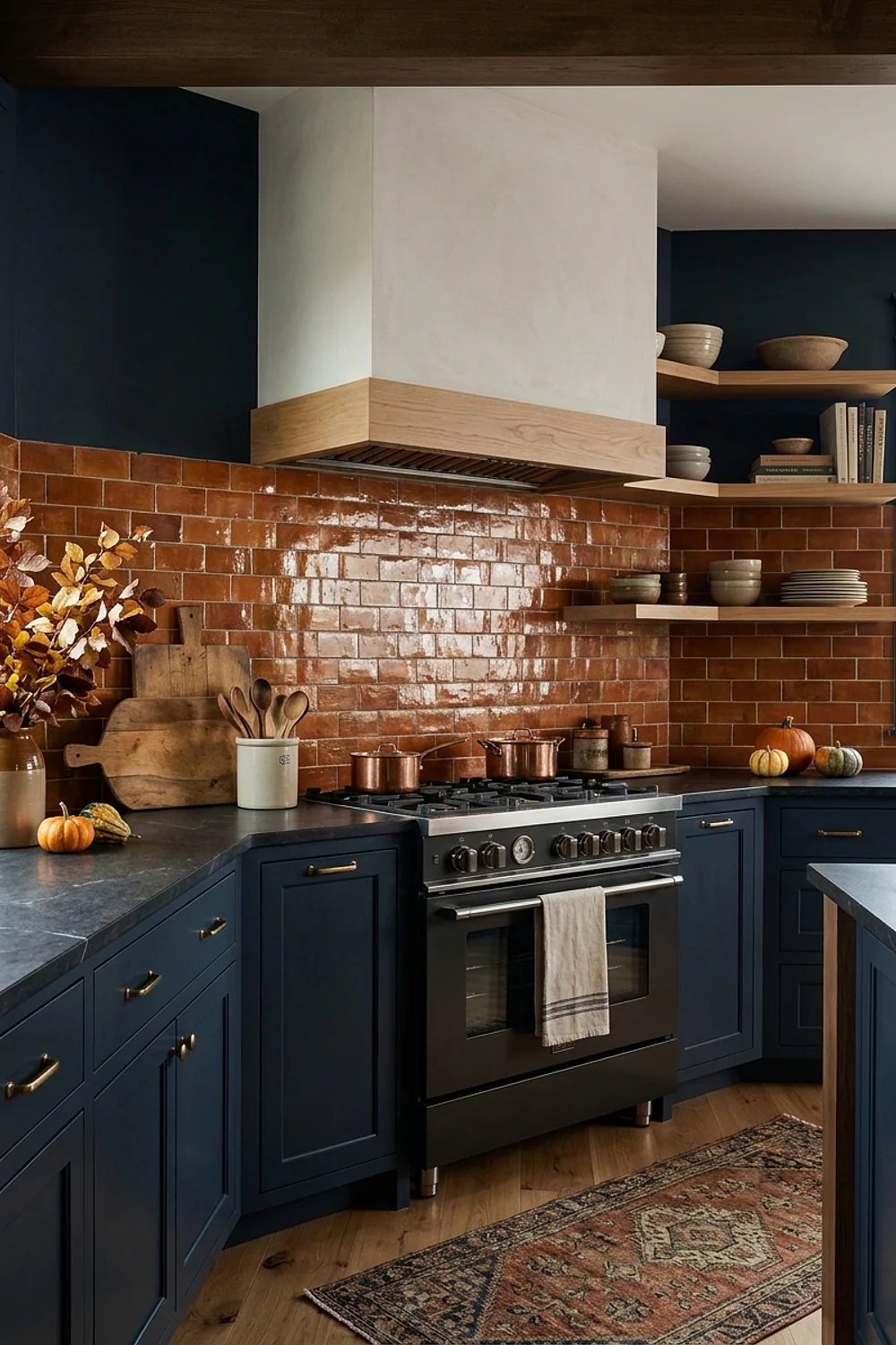
A 3 by 6 inch glazed subway tile in rust or terracotta wipes clean behind a range in a way raw clay never will. Grout in a warm gray looks tidier than white, which yellows near grease.
Check the label for “glazed” before buying. Unglazed terracotta soaks up splatter and needs sealing every year, and that is a lot of upkeep for a backsplash. Tiles typically run $8 to $14 per square foot.
18. India Yellow on the far end wall of a galley
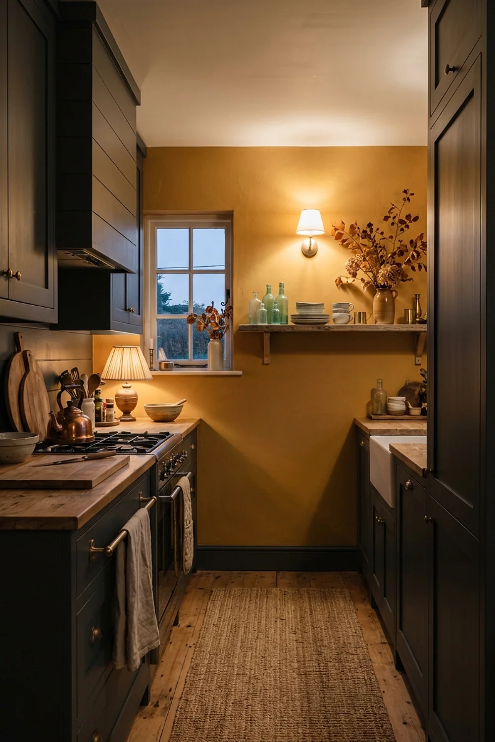
The far wall of a long, narrow kitchen is where the eye lands first, which is why it carries a bold color so well. Painting it Farrow & Ball India Yellow, a mustardy gold, pulls the room forward and makes a 10-foot galley feel intentional rather than merely tight.
It suits tight budgets, since a single wall needs little paint, and galleys with a window or door at that end. Keep the long walls neutral. Yellow on three sides is hard to live with before breakfast, and it shrinks the space.
19. Smoked amber pendants over a cream island
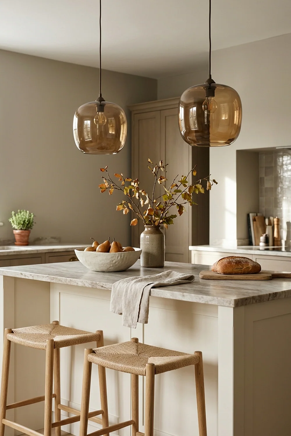
Glass changes the color of the light itself. Smoked amber pendants about 12 inches across cast a honey tone onto a cream island, which does more for a fall mood than any painted wall.
Hang them 30 to 36 inches above the counter, and use 2200K to 2700K filament bulbs. A brighter bulb turns the amber into a harsh orange and ruins the effect.
20. A burnt sienna velvet cushion on the breakfast banquette
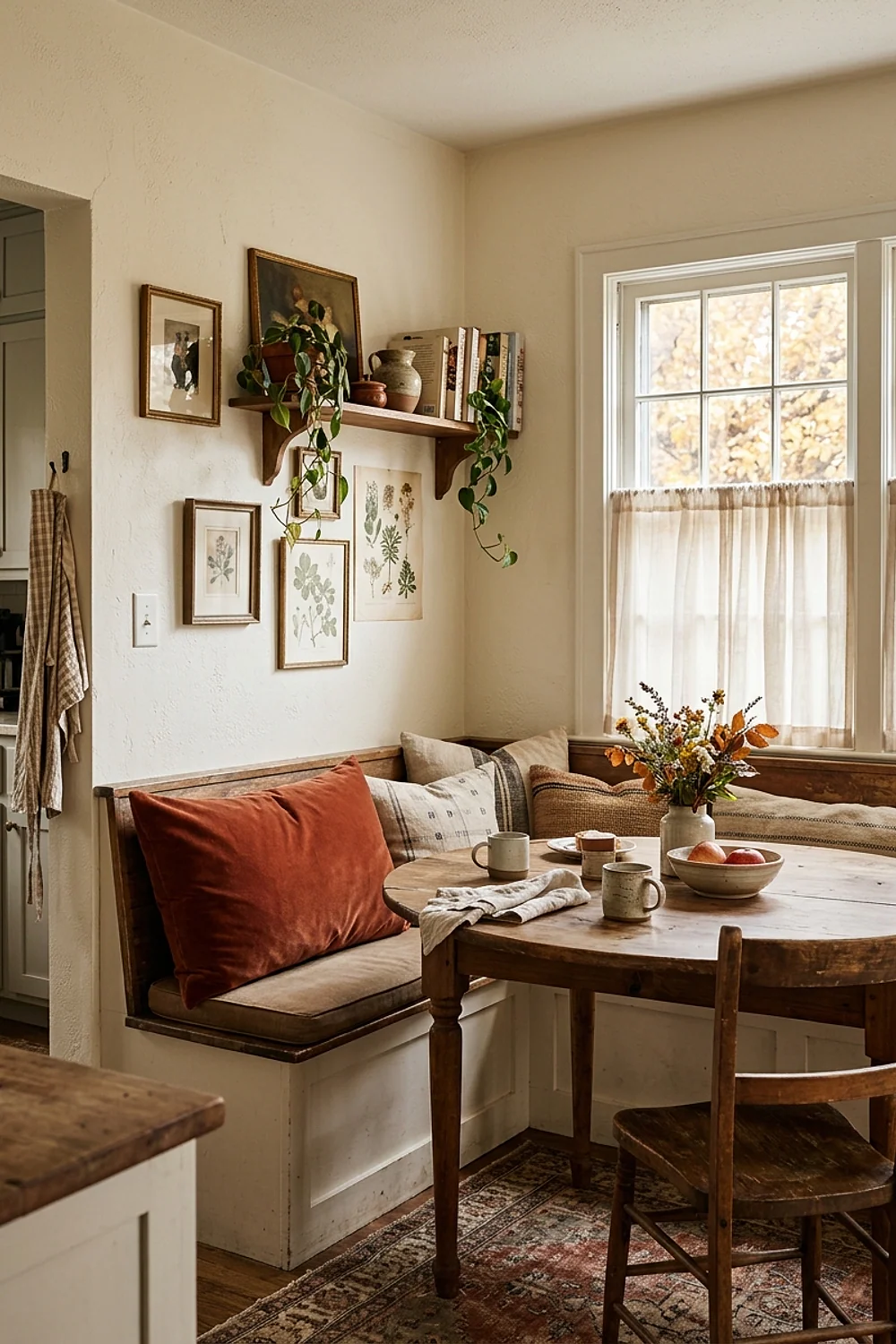
A banquette with a 3 to 4 inch foam seat and a burnt sienna velvet cushion makes a corner worth sitting in. The color works against pale oak or a green wall and costs less than a repaint.
Choose performance velvet, which a damp cloth handles. Real silk velvet crushes and marks under daily use, so it belongs in a bedroom.
21. A Book Room Red pantry door

Like old leather in an autumn kitchen, Farrow & Ball Book Room Red reads as a brownish brick. A pantry door is a small surface, so the color shows up as a punctuation mark and not a mood swing.
It suits all-white and cream kitchens that need one grounding spot. Use a scrubbable eggshell finish, since a pantry door collects hand marks at exactly the same height every day.
Textiles, metals, and small accents that finish the palette
22. Charcoal soapstone with cream cabinets
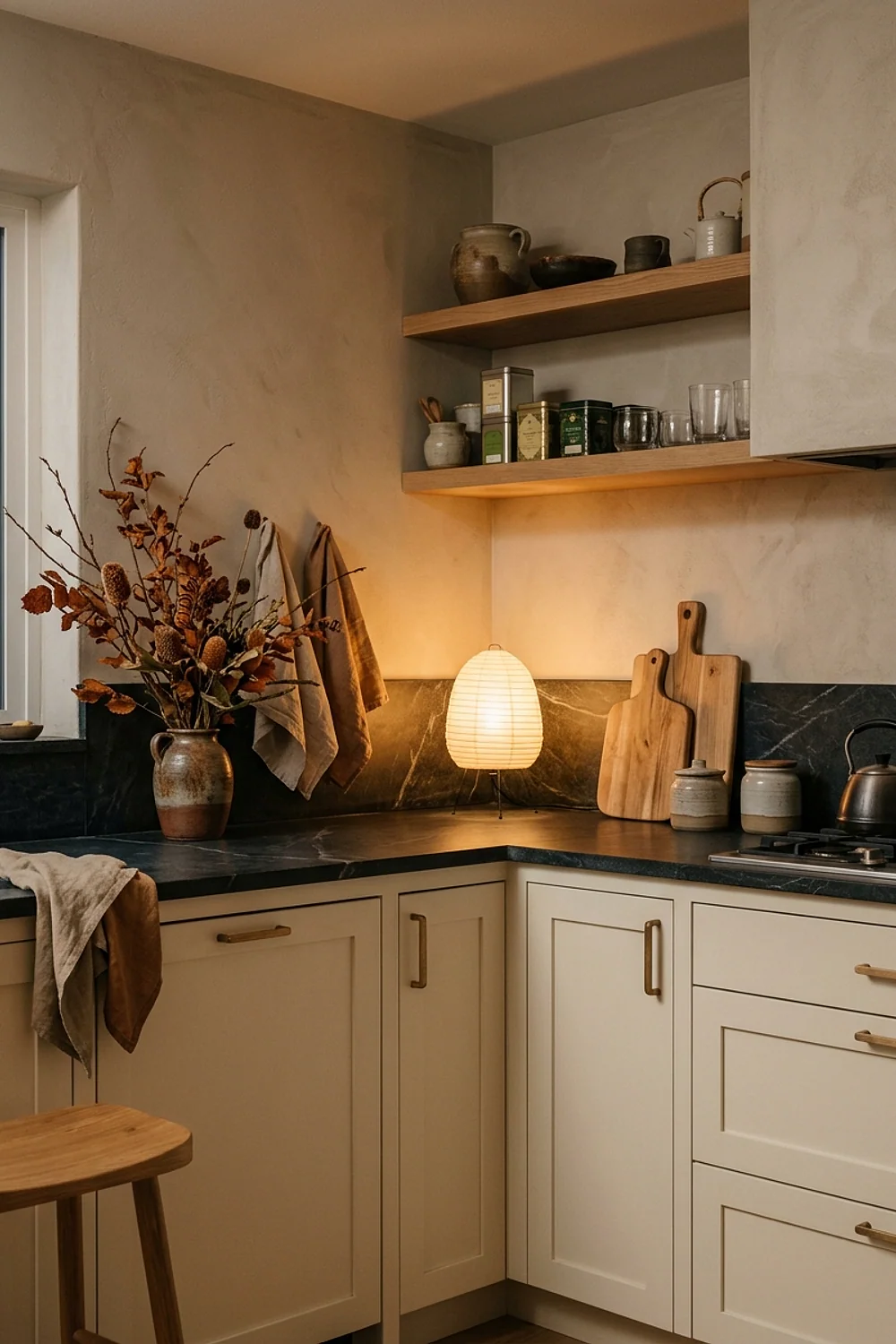
Soapstone is a charcoal that deepens with use, and against cream cabinets it looks like a chalkboard in a farmhouse school. It is dense, heat-proof, and non-porous, which makes it a practical stone as well as a handsome one.
It scratches, though, and some people hate that. Mineral oil darkens it evenly, and light scratches sand out with 220-grit paper. Expect $90 to $150 per square foot installed.
23. Glass-front uppers with amber and brown glassware
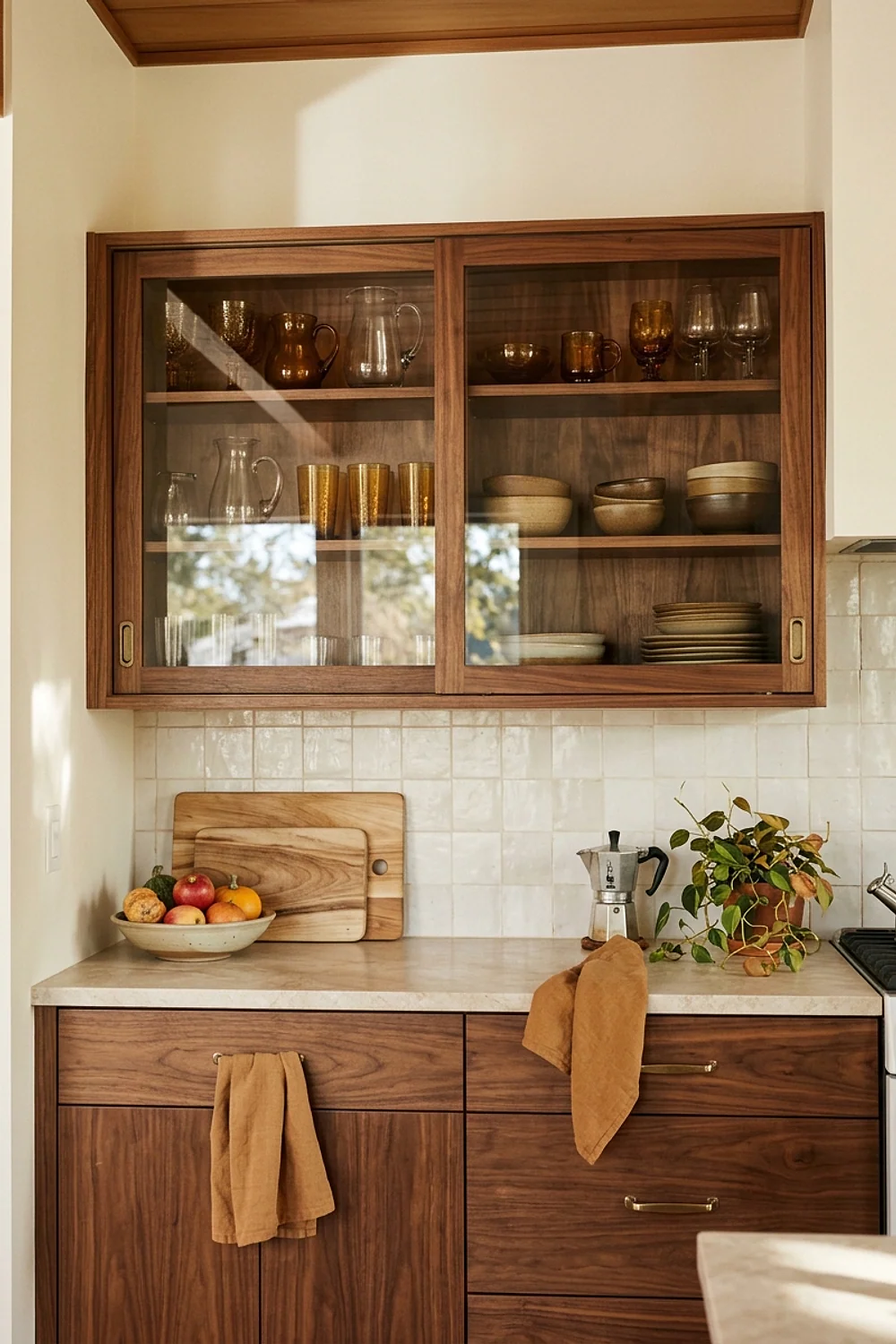
Glass doors turn cabinet interiors into a color feature. Paint the back panel Sherwin-Williams Roycroft Bottle Green, then stack amber and smoke-brown glasses three deep on 12-inch shelves. The dark green makes the warm tones glow, especially when light catches them.
This suits kitchens with a lot of closed storage and nowhere to display anything. Dust shows quickly on glass, and open display punishes clutter, so limit it to two or three doors and keep the rest solid.
24. Mixed wood boards leaned against the backsplash
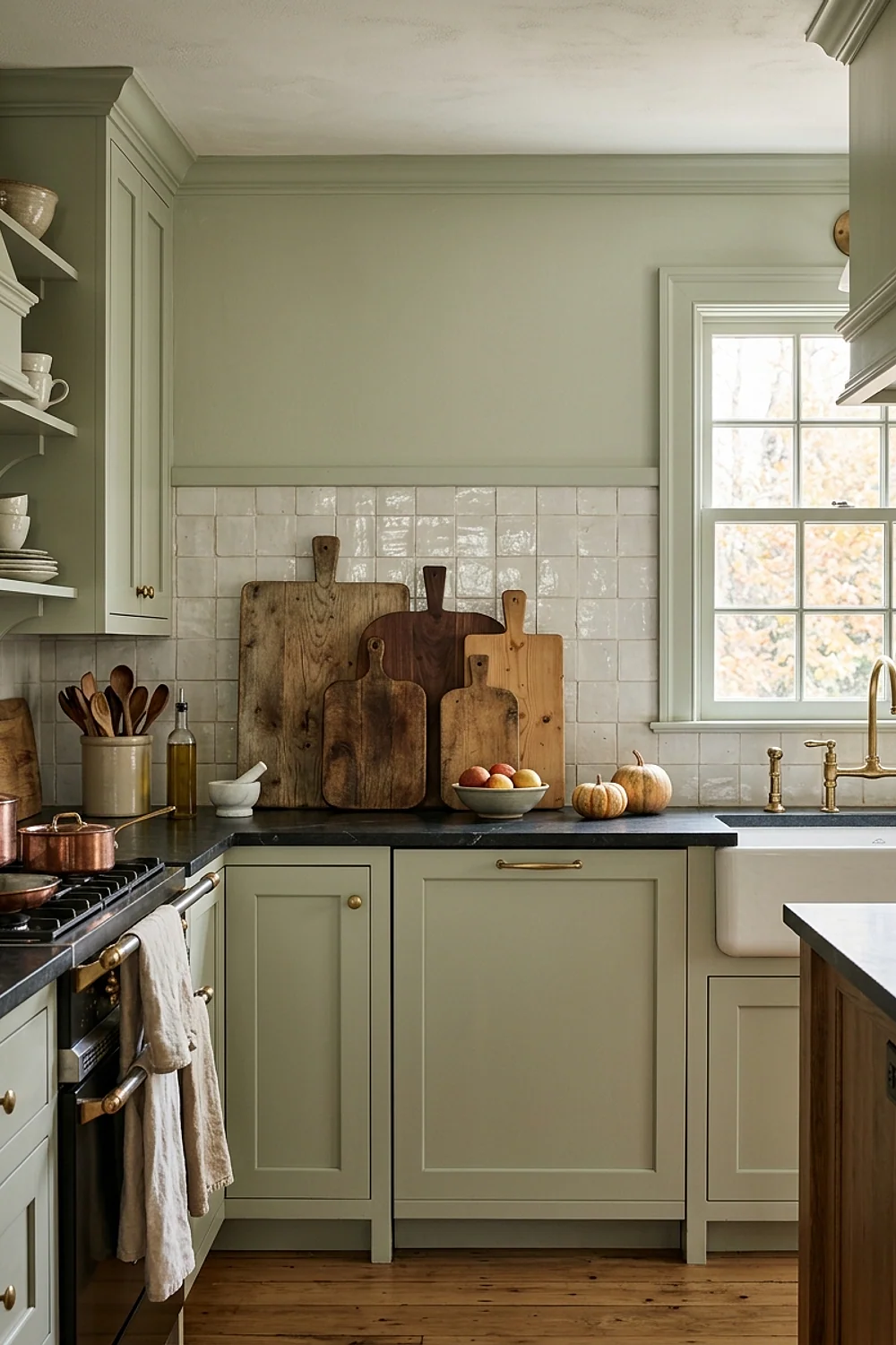
Three boards in walnut, maple, and olive wood lean against a backsplash and add three tones of brown for almost no money. Vary the sizes, with one at 18 inches, one at 14, and one round, so the group looks collected rather than matched.
This suits rentals and tight budgets, and a plain tile or painted backsplash keeps the look clean. Wash them by hand and dry them standing up. A board left flat and wet will warp within a season, and a dishwasher cycle will crack them.
25. One oversized botanical print instead of five small ones
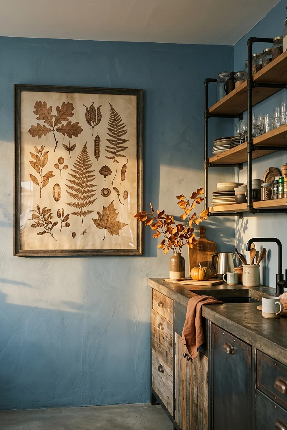
A 24 by 36 inch print of an oak branch or a field of wheat, in an oak frame, does the job of a gallery wall with one nail. The color in the print should repeat a color already in the kitchen, such as rust or olive.
Hang it above a sideboard or a bench, with the center at about 57 inches from the floor. Small prints scattered around read as clutter in a room already full of hardware.
26. Shoji White trim so honey oak stops looking orange
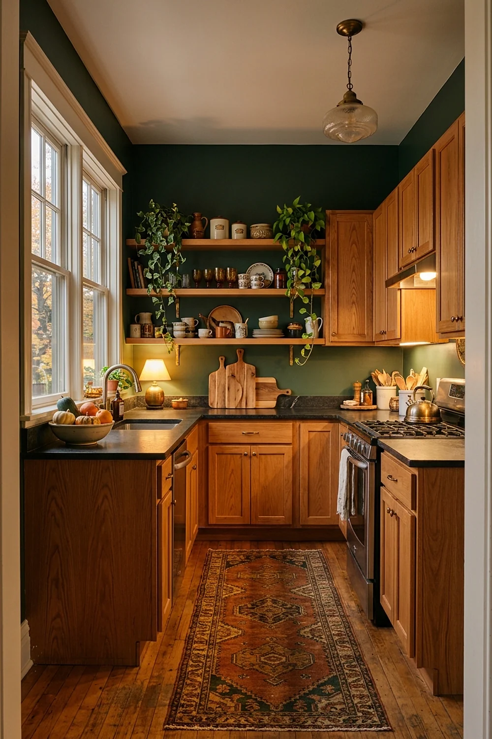
A stark white next to honey oak makes the wood look more orange than it is. Sherwin-Williams Shoji White, a soft cream with a touch of beige, takes the edge off and makes the cabinets look intentionally golden.
This is the cheapest fix for a kitchen from the 1990s. Repaint the trim and walls before replacing a single cabinet door.
27. Oxford Stone walls in a scrubbable finish
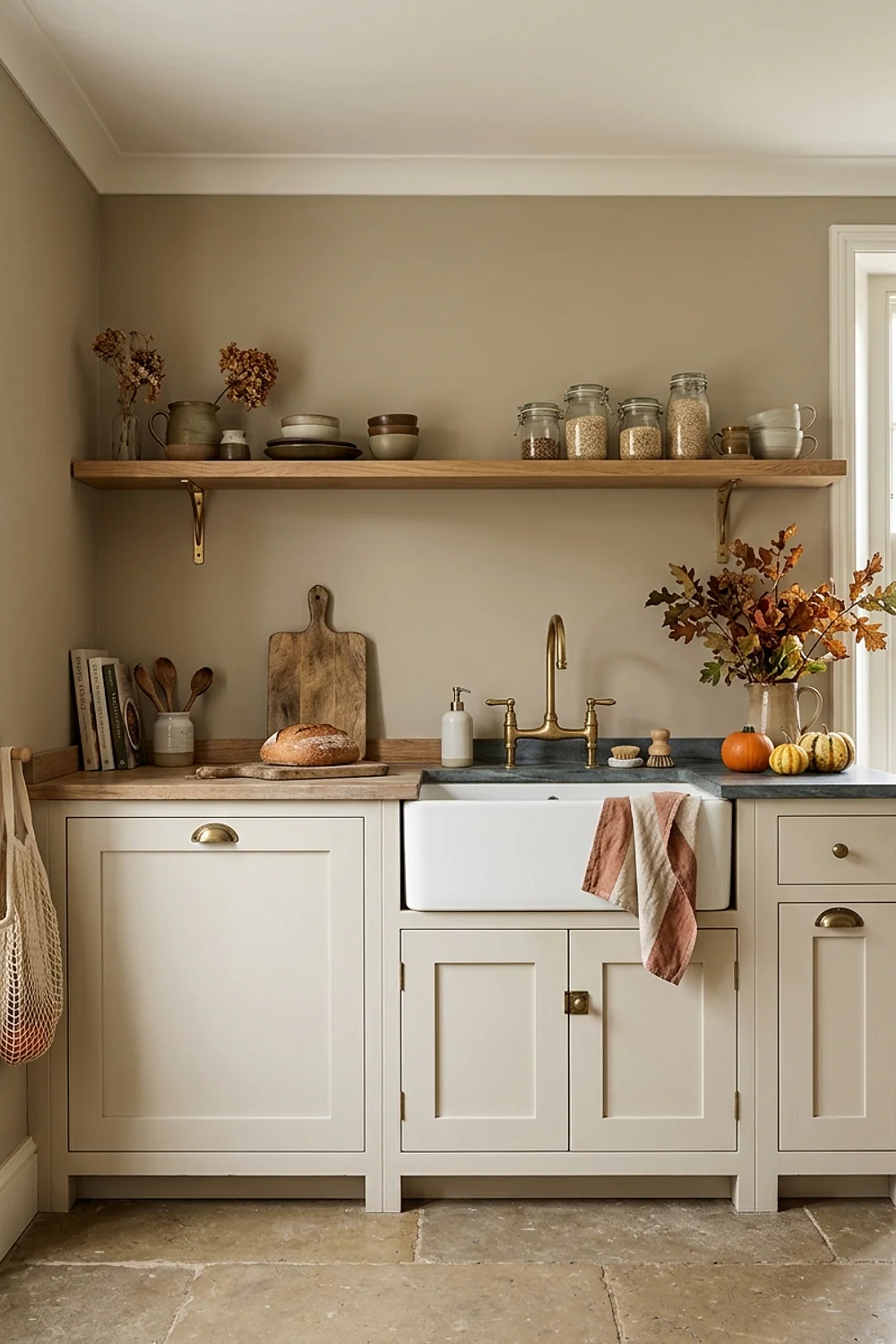
Cabinets and pumpkins do the talking when the walls wear Farrow & Ball Oxford Stone, a drab, warm taupe. The walls near the range and sink need a finish that survives scrubbing, so choose the eggshell or a tough modern formula.
Matte looks better in photographs but shows every wipe mark and scuff. For a kitchen used daily, eggshell is the sensible trade.
28. A palette that fades into the dining room
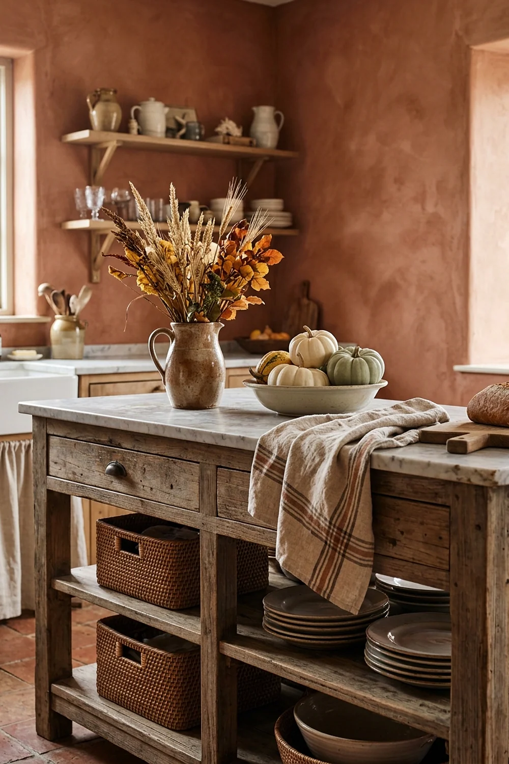
In an open plan, a kitchen’s colors should continue into the next room rather than stop at an invisible line. Repeat the rust from the island on a dining sideboard, or the olive from the cabinets on a set of chairs.
Repeat each color two or three times across the space and the two rooms read as one. Leave the paint colors alone and let the furniture carry them.
29. Salamander walls and candlelight at dusk
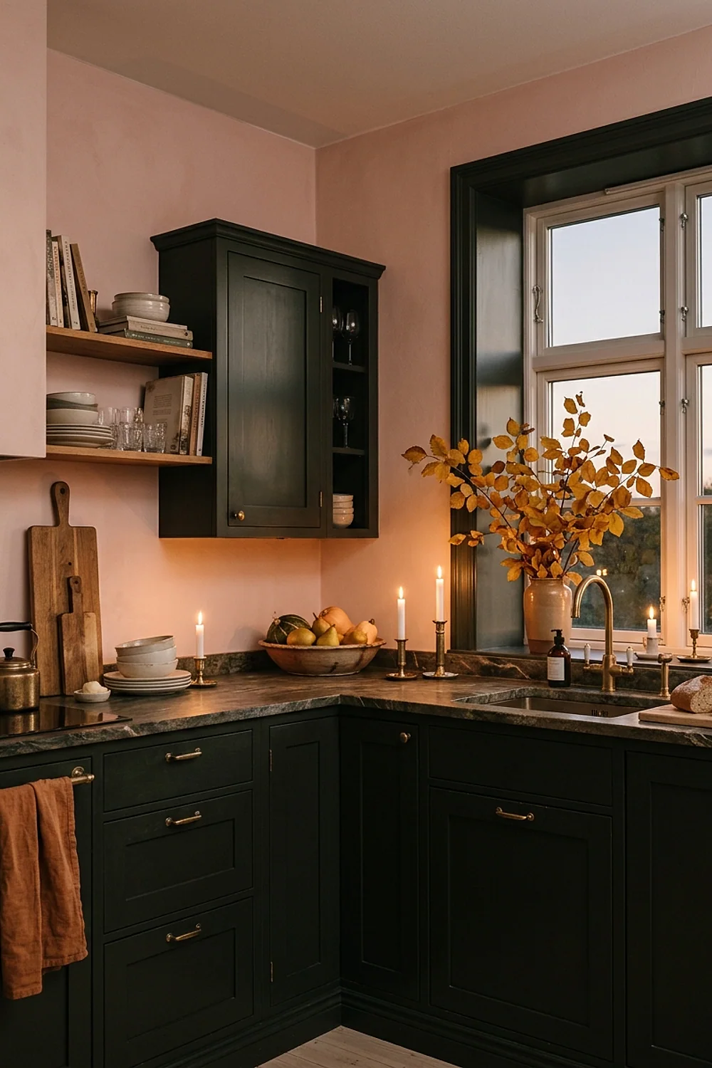
Dark enough to nearly turn black, Benjamin Moore Salamander is a green with real drama. At 5:30pm in late October, with a few beeswax candles and 2200K bulbs, the walls glow like the inside of a wine bottle.
Keep candles at least 12 inches from cabinets. And note that this color only works if the kitchen has some daylight, or it becomes a cave from morning to night.
30. Sheepskin pads on counter stools
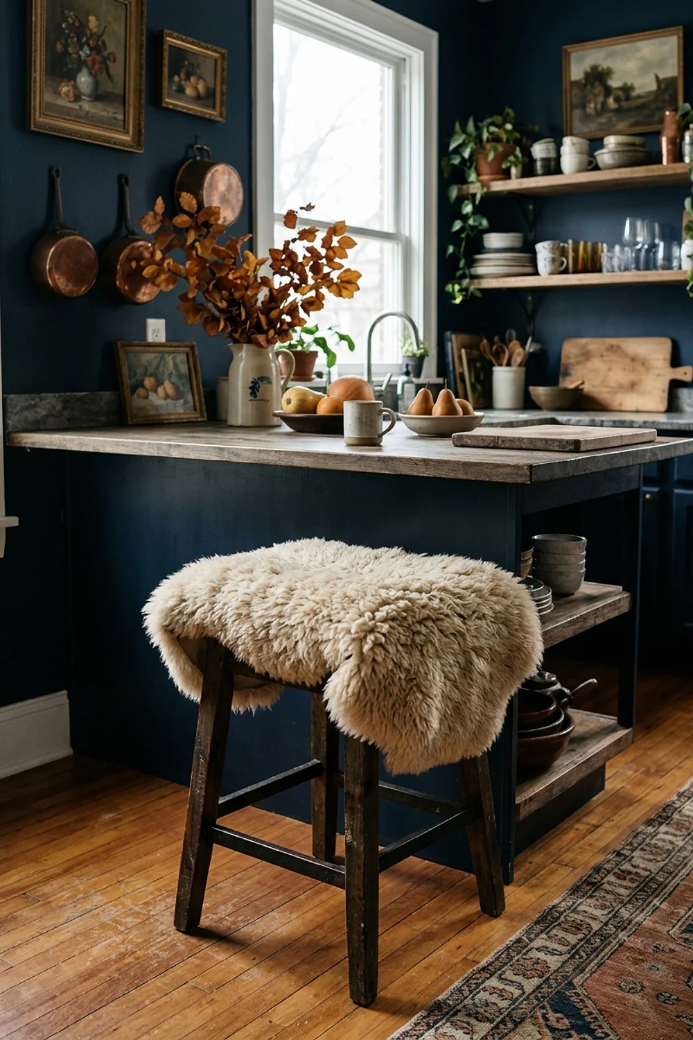
An 18-inch round sheepskin pad in ivory or camel makes a hard wooden stool feel like a seat worth sitting on. It also adds a pale, fluffy contrast against dark cabinets, and the texture softens a room full of hard surfaces.
Sheepskin sheds and can only be spot-cleaned. It suits adult-only households or the occasional breakfast, not a house with three kids and a juice habit, where a wipeable faux version is the safer pick.
31. Dead Salmon with olive linen as the finishing pair
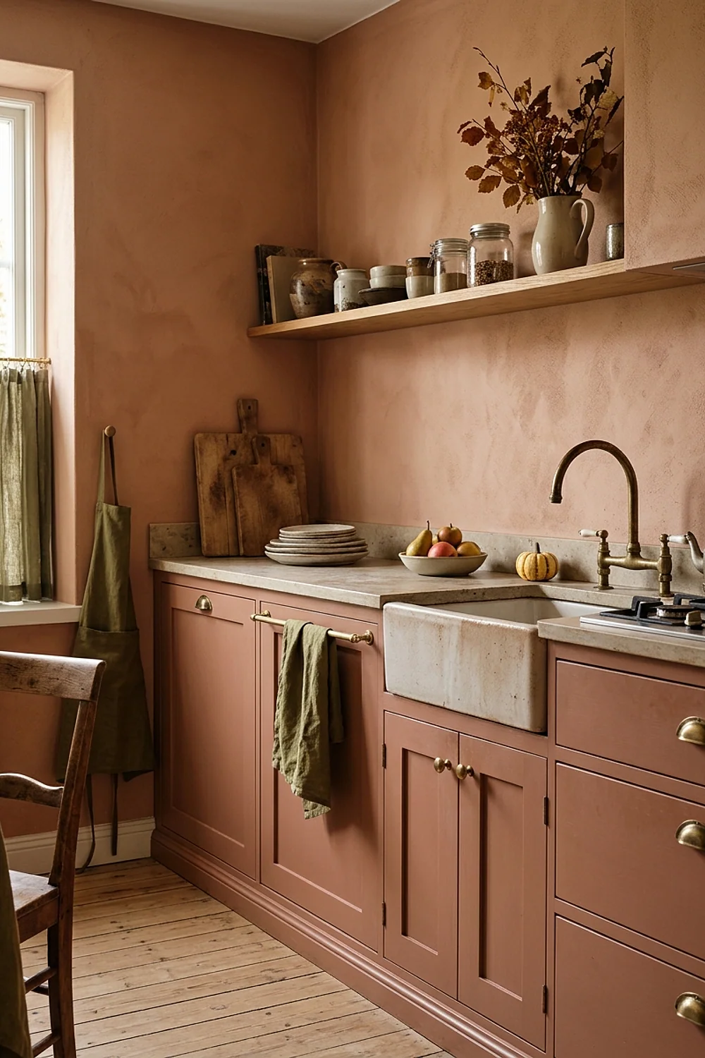
Resembling dried clay, Farrow & Ball Dead Salmon is a dusty pinkish brown. Used on a small wall or a door, with olive linen towels nearby, it sets off a green kitchen without turning sweet.
Use it as the last color added, not the first. If the room already holds rust, ochre, and a dark green, one more strong hue will blur the plan.
Testing colors before you commit
Autumn kitchen decorating goes wrong most often at the chip stage. Judging a color from a 2-inch card is like judging a garden hose by its nozzle, because the wall will stretch that color across 60 square feet and under three different kinds of light.
- Paint a 2-foot square on two different walls, or on a sample board you can move around.
- Look at it at 8am, 4pm, and after dark with the lights on.
- Hold it directly next to the countertop, floor, and any wood tones.
- Wait a full day for it to dry, since many paints shift as they cure.
Sample pots cost around $6 to $10 each, a cheap price for avoiding a repaint.
What went wrong
Autumn kitchen decorating mistakes are rarely fatal, and most can be corrected without repainting everything. A few weeks into living with a new color, the problem usually shows itself clearly: too orange, too heavy, or too yellow at night.
- Too orange: add a green-based neutral nearby, such as Evergreen Fog, or swap the bulbs to a softer 2400K.
- Too dark: paint the ceiling and trim a shade lighter, and add a mirror or glass-front cabinet.
- Too yellow in the evening: change the bulbs first. The paint is probably fine.
By the second coat, many colors look different from the sample, and that’s often a good sign. If it still feels wrong after a full week in every light, repaint only the wall that bothers you, not the whole room.
Settling on your autumn palette
The best autumn kitchen decorating starts with one earthy color, one quiet neutral that shares its undertone, and one dark anchor. Everything else is repetition, texture, and good bulbs.
Save or pin this list so it’s waiting when you’re ready to paint. Then pick a single idea to try first, and tape up one 2-foot sample before buying anything.
Frequently asked questions
What colors work best for autumn kitchen decorating in a small kitchen?
Stick to terracotta, olive, or a warm greige on the walls and keep the ceiling pale. One bold wall or lower cabinet color is plenty, and repeating it in two accessories is enough to tie the room together.
Can I do autumn kitchen decorating in a rental without painting?
Yes. Swap tea towels, a runner, stool pads, and a bowl of pumpkins in rust, ochre, and cream, and add 2700K bulbs. Peel-and-stick tile on the backsplash is a removable option if the lease allows it.
Which paint finish holds up best on kitchen cabinets?
Satin or semi-gloss enamel wipes clean and stands up to hands and splatter. Matte looks softer but shows fingerprints and wear much faster, especially on dark colors.
How do I stop a dark color from making the kitchen feel gloomy?
Use it on one wall or the lower cabinets, and keep the ceiling and trim light. Warm 2700K bulbs and a reflective surface like glass or brass bounce light around and keep the room from feeling closed in.